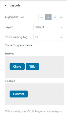
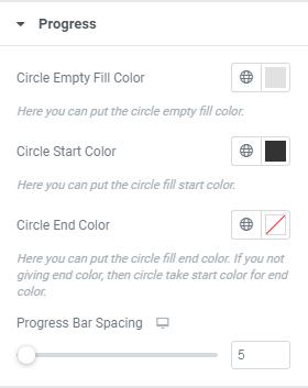
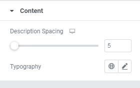
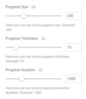
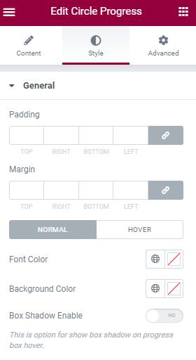
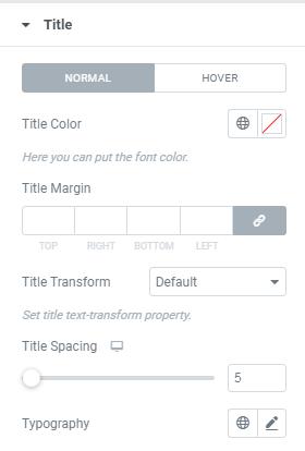
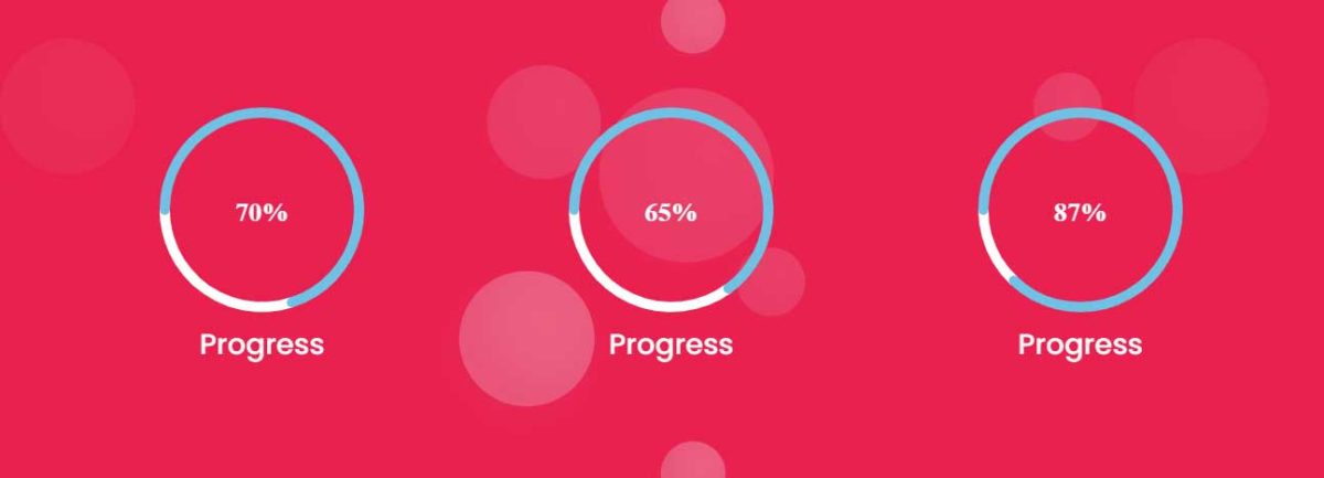
March 17, 2021 This shortcode displays Progress Bar in Circle Shape. Demo Link ProgressTitle – Here Enter the Circle Progress TitleProgress % – Here you can place Progress valueContent – Here you can put Progress content.Progress Size – Here you can set Progress SizeProgress Thickness – Here you can set Circle Progress ThicknessProgress Duration – Here you can place Animation Progress Duration LayoutAlignment – This is option for Title alignment.Layout – Here you can select Circle Progress layout style.Post Heading Tag – Here you can choose heading size.Circle Progress Items – Here you can Enable/Disable items as per your requirments. StyleHere you can set style for Normal View and Hover View.Padding – Here you can set padding value for Circle Progress.Margin – Here you can set margin for Circle Progress.Font Color – Here you can add Circle Progress Font Color.Background Color – Here you can add Background Color.Box Shadow Enable – Here you can Enable/Disable box shadow. ProgressCircle Empty Fill Color – Here you can add Circle Empty Fill Color.Circle Start Color – Here you can add Circle Start Color.Circle End Color – Here you can add Circle End Color.Progress Bar Spacing – This is option for giving space to Progress Bar. TitleTitle Color – Here you can add Title Color.Title Margin – Here you can set margin for Circle Progress Title.Title Transform – Here you can set title Transform Property.Title Spacing – This is option for giving space to Progress Bar Title.Typography – Here you can choose Title font family, size, weight etc.. ContentDescription Spacing – This is option for giving space to Progress Bar Content.Typography – Here you can set Content’s font family, size, weight etc.. ← Contact Form Contact Info → Leave a Reply Cancel replyYour email address will not be published. Required fields are marked *Comment * Name * Email * Website Save my name, email, and website in this browser for the next time I comment.