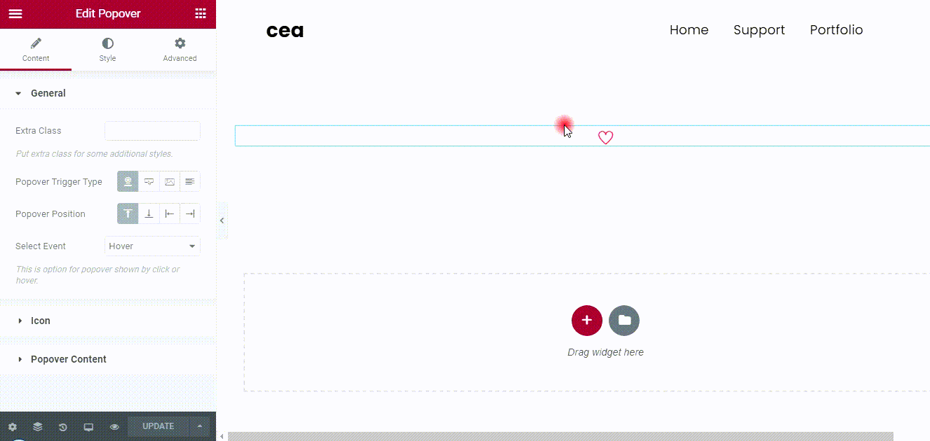
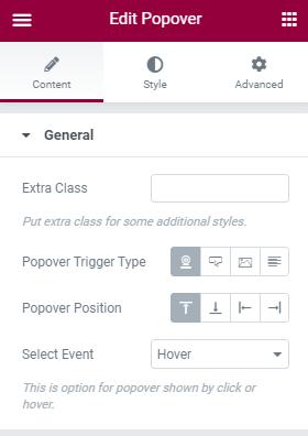
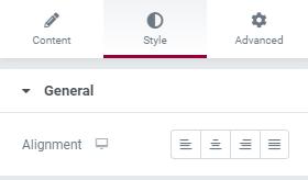
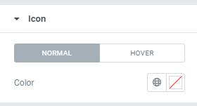
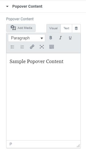
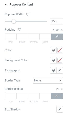
March 22, 2021 This shortcode used to display popover while click on Text, Icon , Image etc.. Pick any one from the following options Icon/Image/Button/Text as per your need. General Extra Class – Here you can add Extra Class for Additional styles. Popover Trigger Type – Here you can choose Popover Trigger Type(Icon/Button/Image/Text). Select Event – This option for show Popover by Click or Hover. Button Type – Here Choose the Type Button. Text – Here you can Enter Text for the Button. Size – Here you can choose button Size(Small/Medium/Large/Extra Small/Extra Large) Icon – Here you can choose Required Icon. Icon Spacing – This is option for giving space to Icon. Button ID – Here you can add Unique Button Id. Popover Content Popover Content– Here you can add Popover Content. Style General Alignment – Here you can choose Image Caption alignment(Left/Right/Center) Button Here you can set Style for Button Normal View and Hover View. Text Shadow – Here you can set shadow effects to the Button Text. Text Color – Here you can add Text Color. Background Color – Here you can add Text Background Color. Border Type – This is option for selecting type of the border. Border Radius – This is option to set value for the Button border radius Padding – Here you can set Padding value for Buttton. Typography – Here you can choose Caption font family, size, weight etc.. Popover Content Popover Width – This Option for set the Popover Width. Padding – Here you can set Padding value for Popover Content. Color – Here you can add Popover Content Color. Background Color – Here you can add Popover Content Background Color. Typography – Here you can choose Content font family, size, weight etc.. Border Type – This is option for selecting type of the border. Border Radius – This is option to set value for the Button border radius Box Shadow – Here you can set shadow effects to the Popover Content. ← Image Grid Modal Popup → Leave a Reply Cancel replyYour email address will not be published. Required fields are marked *Comment * Name * Email * Website Save my name, email, and website in this browser for the next time I comment.