



Extra Classes – You can add extra classes for the Content Carousel.
CSS Animation – You can select animation for the Content Carousel such as Top to bottom, Bottom to top, Left to right, Right to left.
Items to Display – This option allows you enter number of items to Display.
Items to Scrollby – This option allows you enter number of items to Scrollby.
Auto Play – This option allows you enable/disable autoplay option.
Timeout Duration – You can select Timeout Duration for slider.
Infinite Loop – You can set loop for slider.
Margin ( Items Spacing ) – You can add spacing between items.
Items To Display in Tablet – Enter Number of items to Display in Tablet.
Items To Display In Mobile Landscape – Enter Number of items to Display in Mobile Landscape.
Items To Display In Mobile Portrait – Enter Number of items to Display in Mobile Portrait.
Enable Pagination – You can enable/disable pagination for slider.
Enable Navigation – You can enable/disable navigation for slider.

Columns – You can choose column for the Pie Chart such as 3 Columns, 4 Columns, 5 Columns.
Circle Size – Choose the column size from this option.
Circle Line Width – You can add line width for the circle.
Extra Class – You can add extra classes for the Pie Chart.
CSS Animation – You can select animation for the Pie Chart such as Top to bottom, Bottom to top, Left to right, Right to left, Appear from center.
Graphic Values – Input graph values, titles, description and bar color, track color here. Divide values with linebreaks (Enter). Example: 90|Development|Your Description|#FFC400|#ffffff
Heading Color – This option allows you choose color for your heading.
Description Color – This option allows you choose color for description.
Show as Slider? – This option allows you enable the slider option for Pie Chart.
Items to Display – This option allows you enter number of items to Display.
Items to Scrollby – This option allows you enter number of items to Scrollby.
Auto Play – This option allows you enable/disable autoplay option.
Timeout Duration – You can select Timeout Duration for slider.
Infinite Loop – You can set loop for slider.
Margin ( Items Spacing ) – You can add spacing between items.
Items To Display in Tablet – Enter Number of items to Display in Tablet.
Items To Display In Mobile Landscape – Enter Number of items to Display in Mobile Landscape.
Items To Display In Mobile Portrait – Enter Number of items to Display in Mobile Portrait.
Enable Navigation – You can enable/disable navigation for slider.
Enable Pagination – You can enable/disable pagination for slider.

Extra Classes – You can add extra classes for the Counter.
CSS Animation – You can select animation for the Counter such as Top to bottom, Bottom to top, Left to right, Right to left.
Counter Value – You can enter the Counter value
Counter Title – You can add Title for the Counter.
Counter Text Color – Select color for Counter Text.
Title Text Color – This option allow you to select color for Title Text.
Icon Position – This option allow you to select the position for Icon such as Top or Bottom.
Choose from Icon library – Select icon library such as Font Awesome, Lineicons, Flaticons, Icomoon.
Icon Color – This option allows you select color for the Icon.

Extra Class – This option allow you to add Extra class.
CSS Animation – You can select animation for the Woo Latest such as Top to bottom, Bottom to top, Left to right, Right to left.
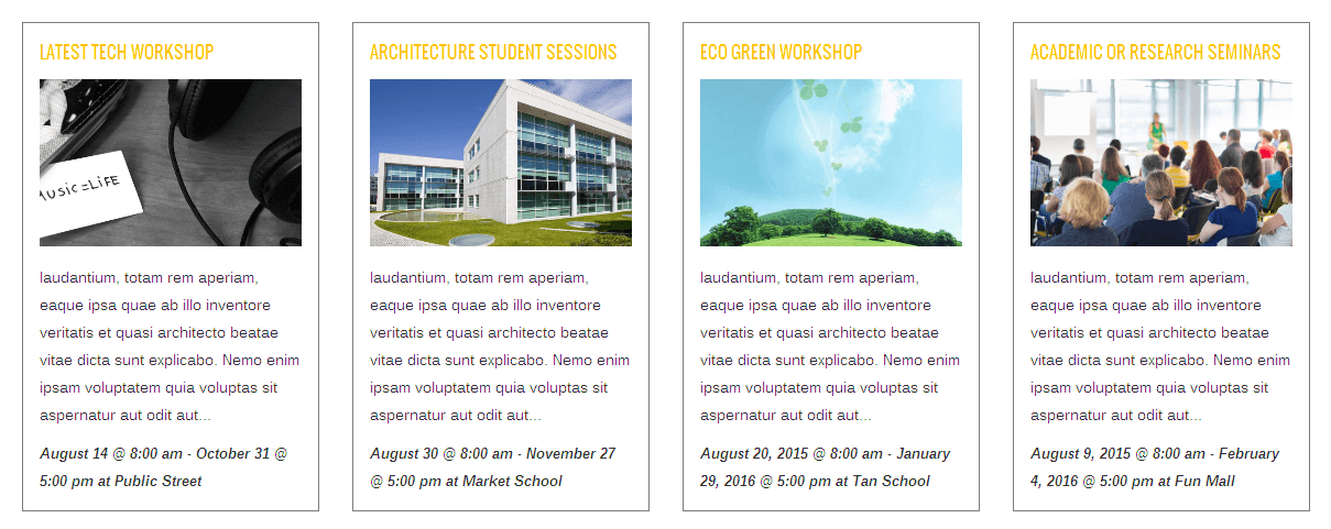
Style – This option allow you to show the Event as List Style or Grid Style.
Skin – This option allow you to select the layout style such as Deafult or Transparent.
Posts Per Page – You can set the number of posts per page.
List Events – This option allow you to choose the List Events such as Category or List of ID’s.
Include Categories – Enter the slugs of a categories (comma seperated) to pull posts from or enter “all” to pull recent posts from all categories. Example: category-1, category-2.
Exclude Categories – Enter the slugs of a categories (comma seperated) to exclude. Example: category-1, category-2.
Order By – This options allows you to choose the Events to show in Ascending order or Descending Order.
Order by Key – This option allows you to show the Events by Start Date or End Date.
Event Title Type – You can select the Event title from h2 to h6 heading styles.
Event Title Text Transform – You can select the Text Transform styles for Event title.
Event Title Font Size – Enter the font size for the Event Title.
Show Event Details? – You can Enable/Disable the Event Details.
Show Event Venue? – You can Enable/Disable the Event Venue Details.
Show Excerpt? – You can Enable/Disable the Excerpt?.
Excerpt Length – Enter the Length for Excerpt.
Show Thumbnail Image? – Enable/Disable the Thumbnail image option.
Thumbnail Width – Enter the Thumbnail image width.
Thumbnail Height – Enter the Thumbnail image Height.
Message – Enter the Message to show when there are no events.
View All Events – Choose to show “View all events” or not.
Content Order – Enter the content to Manage the order of content with commas.
Events from Specific Month – Type “current” for displaying current month only. Ex: 2015-06 or current
Show Outdated Events – You can Enable/Disable Outdated Events.
Background Color – This option allows choose background color for Events.
Border Width – This option allows you enter border width. Ex: 1px or 2px.
Content Color – Select the Content color.
Border Color – This option allows you choose border color.
Event Title Color – You can choose Event Title color.
Extra Class – This option allow you to add Extra class.
CSS Animation – You can select animation for the Woo Latest such as Top to bottom, Bottom to top, Left to right, Right to left.
Style – This option allow you to show the Event as List Style or Grid Style.
Skin – This option allow you to select the layout style such as Deafult or Transparent.
Posts Per Page – You can set the number of posts per page.
List Events – This option allow you to choose the List Events such as Category or List of ID’s.
Include Categories – Enter the slugs of a categories (comma seperated) to pull posts from or enter “all” to pull recent posts from all categories. Example: category-1, category-2.
Exclude Categories – Enter the slugs of a categories (comma seperated) to exclude. Example: category-1, category-2.
Relation – This options allows you to choose AND or OR relation.
Show Pagination? – You can Enable/Disable the Pagination option.
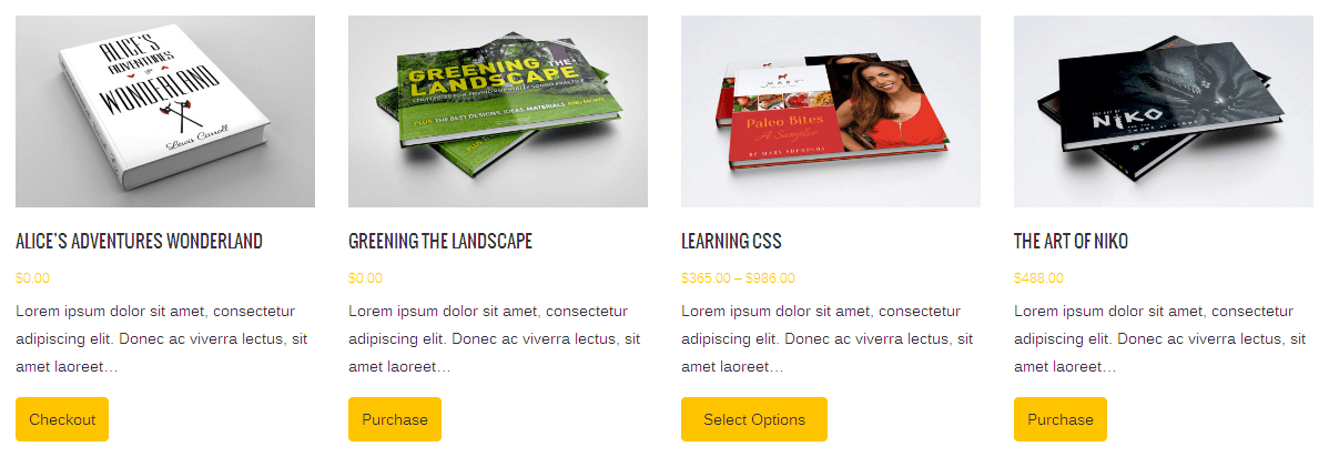
Show Price? – This option allows you to show/hide the Price option.
Show Excerpt? – You can Enable/Disable the Excerpt?.
Excerpt Length – Enter the Length for Excerpt.
Show Full Content? – You can Enable/Disable the Full Content option.
Show Buy Button? – This option allows you to show/hide Buy Button.
Show Thumbnails? – Enable/Disable the Thumbnail option.
Order By – You can choose Order By option such as Price, ID, Random, Post Date, Title.
Order – You can choose Ascending or Descending Order.
Downloads Title Type – Choose Download Title type such as h2,h3,h4,h5,h6.
Downloads Title Text Transform – Choose Text Transform style for the Download Title.
Downloads Title Font Size – Enter Title Font Size in px. Ex: 18px.
Title Color – This option allows choose Title color for Easy Digital Downloads.
Content Color – This option allows you enter border width. Ex: 1px or 2px.
Price Color – This option allows you choose border color.
Extra Classes – You can add extra classes for the Pricing Table.
CSS Animation – You can select animation for the Pricing Table such as Top to bottom, Bottom to top, Left to right, Right to left.
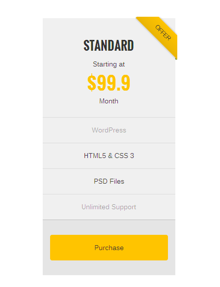
Featured – You can select the plan should be featured or not.
Featured Text – This option allow you to add Featured Text.
Pricing Plan – You can enter the Pricing Plan such as basic, standard, etc.
Plan Font Color – This option allow you to select color for Plan.
Cost Before Text – Enter the Text to show before Cost.
Cost – Enter the Cost for Plans.
Per Text – Enter the Text which is shown after Cost.
Cost Font Color – Chose the color for Cost.
Cost Position – This option allow you to select position for cost such as Default, Before Button.
Features – Enter your pricing content.
Features Active Font Color – This option allow you to select color for Active Features.
Features InActive Font Color – This option allow you to select color for Inactive Features.
Features Divider Color – This option allow you to select color for divider.
Image – This option allow you choose the image if you need it in pricing table.
Enable Video? – This option allow you to enable the Video option by click the checkbox.
Button URL – This option allow you to add URL for your button.
Button Text – This option allow you to add Text for your button.
Before using Blog Setting in Visual Composer Shortcodes, Check whether you have created the Custom Post already. If not, Click this link to know that How To Create The Post.
Extra Classes – You can add extra classes for Blog Settings.
CSS Animation – You can select animation for the Blog Settings such as Top to bottom, Bottom to top, Left to right, Right to left.
Posts per Page – Enter the number of Post per Page.
Include Categories – Enter the slugs of a categories (comma seperated) to pull posts from or enter “all” to pull recent posts from all categories. Example: category-1, category-2.
Exclude Categories – Enter the slugs of a categories (comma seperated) to exclude. Example: category-1, category-2.
Show Thumbnail – This option allow you enable/disable the Thumbnail options.
Hide Author Name – This option allow you to show/hide the Author Name.
Hide Post Date – This option allow you to show/hide the Post Date.
Hide Post Categories – This option allow you to show/hide the Categories.
Hide Comments Count – This option allow you to show/hide the Comments.
Hide Read More Link – This option allow you to show/hide Read More link.
Show Social Sharing – This option allow you to show/hide Social Sharing options.
Blog Layout – You can choose layout such as Large Image Posts, Medium IMage Posts, Grid Posts.
Pagination – You can choose pagination option such as Hide, Pagination, Infinite Scroll.

Before using Portfolio in Visual Composer Shortcodes, Check whether you have created the Custom Portfolio already. If not, Click this link to know that How To Create The Portfolio.

Extra Class – This option allow you to add Extra class.
CSS Animation – You can select animation for the Portfolio Slider such as Top to bottom, Bottom to top, Left to right, Right to left.
Include Categories – Enter the slugs of a categories (comma seperated) to pull posts from or enter “all” to pull recent posts from all categories. Example: category-1, category-2.
Exclude Categories – Enter the slugs of a categories (comma seperated) to exclude. Example: category-1, category-2.
Items to Display – This option allows you enter number of items to Display.
Items to Scrollby – This option allows you enter number of items to Scrollby.
Auto Play – This option allows you enable/disable autoplay option.
Timeout Duration – You can select Timeout Duration for slider.
Infinite Loop – You can set loop for slider.
Margin ( Items Spacing ) – You can add spacing between items.
Items To Display in Tablet – Enter Number of items to Display in Tablet.
Items To Display In Mobile Landscape – Enter Number of items to Display in Mobile Landscape.
Items To Display In Mobile Portrait – Enter Number of items to Display in Mobile Portrait.
Enable Navigation – You can enable/disable navigation for slider.

Extra Class – This option allow you to add Extra class.
CSS Animation – You can select animation for the Client Slider such as Top to bottom, Bottom to top, Left to right, Right to left.
Client/Brand Images – Select images from media library.
Custom Links – Enter links for each image here. Divide links with linebreaks (Enter).
Link Target – You have option to set the target to Same Window or New Window.
Items to Display – This option allows you enter number of items to Display.
Items to Scrollby – This option allows you enter number of items to Scrollby.
Auto Play – This option allows you enable/disable autoplay option.
Timeout Duration – You can select Timeout Duration for slider.
Infinite Loop – You can set loop for slider.
Margin ( Items Spacing ) – You can add spacing between items.
Items To Display in Tablet – Enter Number of items to Display in Tablet.
Items To Display In Mobile Landscape – Enter Number of items to Display in Mobile Landscape.
Items To Display In Mobile Portrait – Enter Number of items to Display in Mobile Portrait.
Enable Navigation – You can enable/disable navigation for slider.

Before using Testimonial in Visual Composer Shortcodes, Check whether you have created the Custom Portfolio already.
Extra Class – This option allow you to add Extra class.
CSS Animation – You can select animation for the Testimonial such as Top to bottom, Bottom to top, Left to right, Right to left.
Testimonial Style – You can select Testimonial style such as Default Style, Border Style, Border Style2, Without Border.
Choose Testimonial Categories – This option allow you to choose categories such as Show all categories, Clients, Reviews.
Items to Display – This option allows you enter number of items to Display.
Items to Scrollby – This option allows you enter number of items to Scrollby.
Auto Play – This option allows you enable/disable autoplay option.
Timeout Duration – You can select Timeout Duration for slider.
Infinite Loop – You can set loop for slider.
Margin ( Items Spacing ) – You can add spacing between items.
Items To Display in Tablet – Enter Number of items to Display in Tablet.
Items To Display In Mobile Landscape – Enter Number of items to Display in Mobile Landscape.
Enable Navigation – You can enable/disable navigation for slider.
Items To Display In Mobile Portrait – Enter Number of items to Display in Mobile Portrait.

Before using Team in Visual Composer Shortcodes, Check whether you have created the Custom Portfolio already.
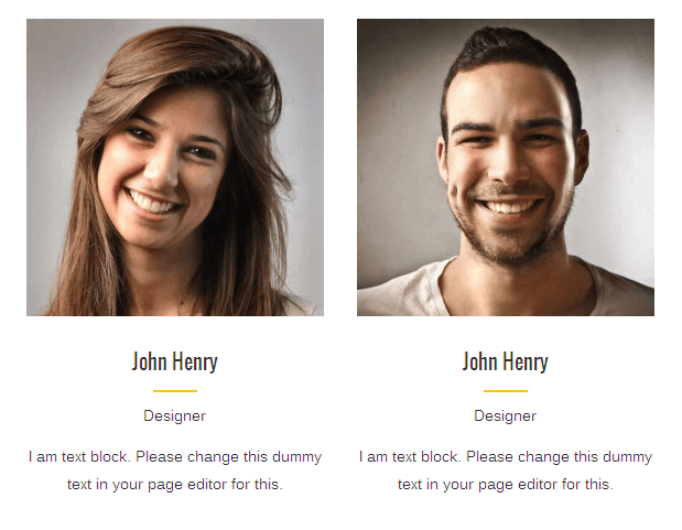
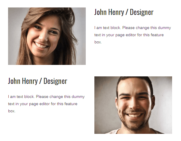
Extra Class – This option allow you to add Extra class.
CSS Animation – You can select animation for the Team slider such as Top to bottom, Bottom to top, Left to right, Right to left.
Alignment – This option allow you to choose alignment option such as Default, Left, Right, Center.
Show Social Icons – Enable/Disable to show the Social Icons.
Choose Team Categories – This option allow you to choose categories.
Items to Display – This option allows you enter number of items to Display.
Items to Scrollby – This option allows you enter number of items to Scrollby.
Auto Play – This option allows you enable/disable autoplay option.
Timeout Duration – You can select Timeout Duration for slider.
Infinite Loop – You can set loop for slider.
Margin ( Items Spacing ) – You can add spacing between items.
Items To Display in Tablet – Enter Number of items to Display in Tablet.
Items To Display In Mobile Landscape – Enter Number of items to Display in Mobile Landscape.
Items To Display In Mobile Portrait – Enter Number of items to Display in Mobile Portrait.
Navigation – You can enable/disable Navigation for slider.
Pagination – You can enable/disable Pagination for slider.
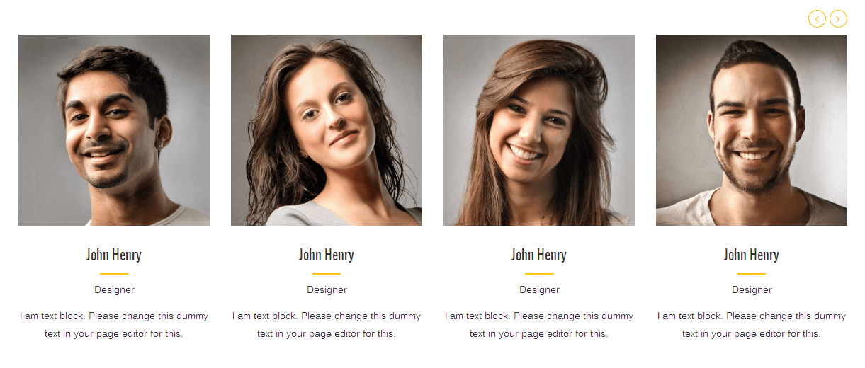
Extra Class – This option allow you to add Extra class.
CSS Animation – You can select animation for the Twitter such as Top to bottom, Bottom to top, Left to right, Right to left.
Consumer Key – This option allow you to enter the Consumer Key for Twitter.
Consumer Secret – This option allow you to enter the Consumer Secret for Twitter
Access Token – This option allow you to enter the Access Token for Twitter.
Access Token Secret – This option allow you to enter the Access Token Secret for Twitter.
Twitter Screen Name – Enter the name for Twitter Screen name.
Number of Tweets – Enter the number of Tweets.
Auto Play – This option allows you enable/disable autoplay option.
Timeout Duration – You can select Timeout Duration for slider.
Infinite Loop – You can set loop for slider.
Margin ( Items Spacing ) – You can add spacing between items.
Navigation – You can enable/disable Navigation for slider.
Pagination – You can enable/disable Pagination for slider.
Note: Please given this details “consumer_key”, “consumer_secret”, “access_token”, “access_token_secret”, “screen_name” from your twitter account.

Extra Class – This option allow you to add Extra class.
CSS Animation – You can select animation for the Twitter such as Top to bottom, Bottom to top, Left to right, Right to left.
Auto Play – This option allows you enable/disable autoplay option.
Timeout Duration – You can select Timeout Duration for slider.
Infinite Loop – You can set loop for slider.
Margin ( Items Spacing ) – You can add spacing between items.
Navigation – You can enable/disable Navigation for slider.
Pagination – You can enable/disable Pagination for slider.
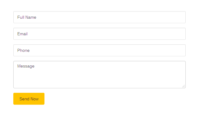
Extra Class – This option allow you to add Extra class.
CSS Animation – You can select animation for the Mailchimp Form such as Top to bottom, Bottom to top, Left to right, Right to left.
Form Layout – This option allow you to choose layout such as Default, Two Column Style.
Mailing List – This option allow you to Select the list to sent the Mail.
Placeholder Text – Enter the Placeholder Text.
Button Text – Enter the text for the Button.
Button Alignment – This option allow you to set the alignment such as Inline, Right, Bottom.
Set full width button? – Click on Checkbox to show the Fullwidth Button.
Add icon? – Click on Checkbox to Add icon for the button.
Button Background Color – Select button Background Color.
Button Text Color – Select button text color.
Button Hover Background Color – Select button Hover Background Color
Button Hover Text Color – Select Button hover color for Text.

Extra Class – This option allow you to add Extra class.
CSS Animation – You can select animation for the Woo Latest such as Top to bottom, Bottom to top, Left to right, Right to left.
Number Of Products – Enter the Number of Products.
Items to Display – This option allows you enter number of items to Display.
Items to Scrollby – This option allows you enter number of items to Scrollby.
Auto Play – This option allows you enable/disable autoplay option.
Timeout Duration – You can select Timeout Duration for slider.
Infinite Loop – You can set loop for slider.
Margin ( Items Spacing ) – You can add spacing between items.
Items To Display in Tablet – Enter Number of items to Display in Tablet.
Items To Display In Mobile Landscape – Enter Number of items to Display in Mobile Landscape.
Items To Display In Mobile Portrait – Enter Number of items to Display in Mobile Portrait.
Enable Navigation – You can enable/disable navigation for slider.
