Pageloader

Theme Documentation – Shortcodes

Shortcodes

Metal includes all the shortcodes inside our theme Core plugin which is installed and activated. Also Visual Composer is included in our theme and its having various shortcodes. Read the following in detail that how to use the shortcodes and its options.

  • Shortcode Generator
  • Visual Composer Shortcodes

Shortcode Generator

Metal includes the Shortcode Generator. The generator has a user interface that allows you to quickly and easily use shortcodes and all the options that go with them. All shortcodes are accessed the Visual Editor in your WordPress Admin. Each shortcode has its own unique options.

  • Navigate to Pages > Add New in your admin sidebar or click Add New option from the page option.
  • Open a page and click on the Visual tab.
  • In the editing toolbar, click the shortcode icon to initiate the generator.
  • The Popup window is open and select the shortcode to use from the dropdown list.
  • You can customize your settings on the shortcode options.
  • Then click the Insert Shortcode button and it will be inserted on the page.

Shortcode list

Below showing a complete list of all the shortcodes included in our theme and having customization options for each one. The following list of shortcodes arranged same list you see in the visual editor, under the Shortcode Generator.

  • Accordion
  • Alert
  •  Blockquotes
  • Bootstrap Carousel
  • Button
  • Circle Counters
  • Columns
  • Contact Form
  • Client Slider
  • Counters
  • Day Counter
  • Dropcap
  • Font Awesome
  • Fullwidth Box
  • Google Map
  • Highlight
  • HTML Block
  • Icons
  • Image Frame
  • Jumbotron
  • Lead Paragraph
  • List Item
  • Modals
  • Page Header
  • Popover
  • Progress Bar
  • SoundCloud
  • Tabs
  • Table
  •  Tooltip
  • Vimeo
  •  Youtube

Accordion

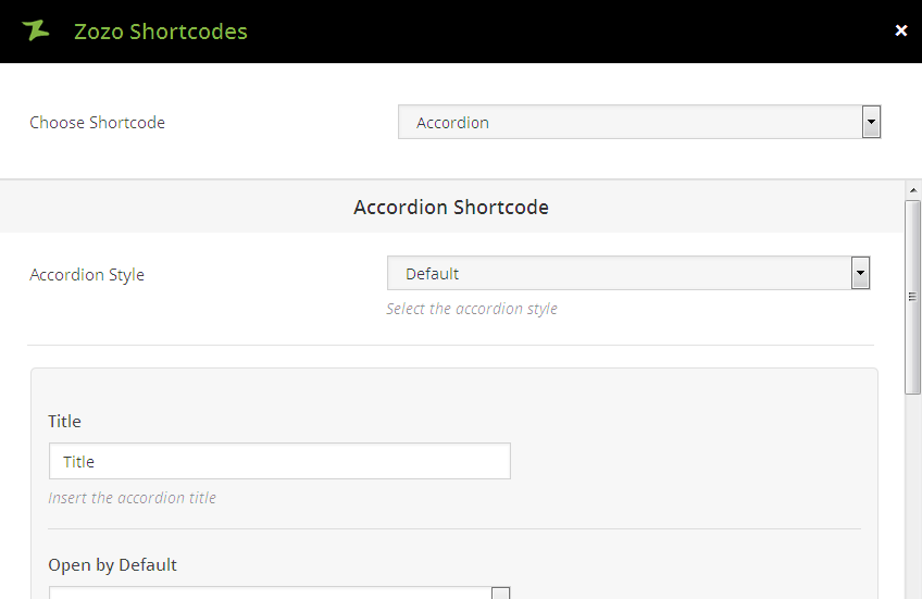
  • Accordion Style – Select the accordion style such as Default and Classic.
  • Title – This option allow you to Enter title to show the Accordion title.
  • Open By Default – Choose to have the accordion open by default.
  • Parent Accordion ID – You have to give different ID for each accordion.
  • Accordion Content – Enter content to show the Accordion content.
Sample Content
Sample Content
Sample Content

Accordion Output

Alerts

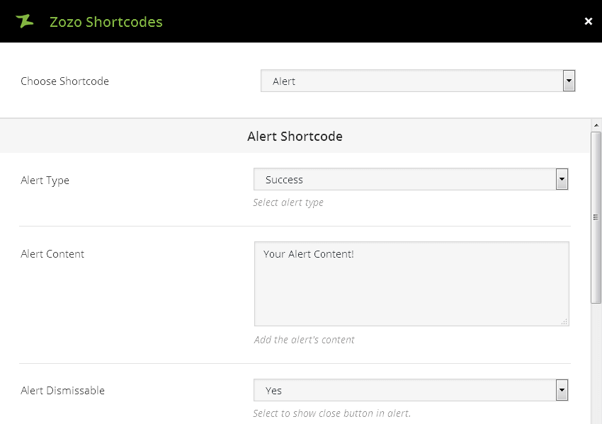
  • Type – Sets the type of alert such as Success, Info, Warning, Danger for your Alert Message.
  • Content – This option allows you to add the content for your Alert Message.
  • Dismissable – Select to show close button in alert.
  • Animation Type – Select the animation type such as bounce, fade, flash, rubberBand, shake, slide, or zoom etc for shortcode.
  • Animation Delay – Set the animation delay for shortcode.

Alert Output

Blockquotes

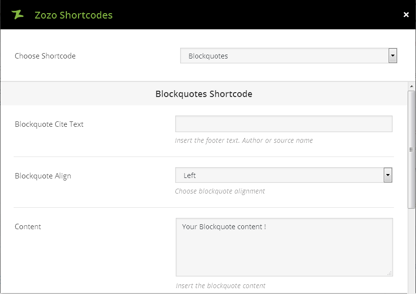
  • Cite Text – You can Insert the footer text such as Author or source name.
  • Align – This option allows you to align the blockquote as left or right combination.
  • Content – This option allows you to add the content for your Blockquote.
  • Animation Type – Select the animation type such as bounce, fade, flash, rubberBand, shake, slide, or zoom etc for shortcode.
  • Animation Delay – Set the animation delay for shortcode.

Your Blockquote content !

Sample

Blockquotes Output

Bootstrap Carousel

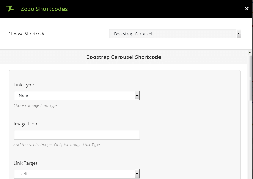
  • Link Type – You can choose image link type such as Lightbox or Link.
  • Image Link – This option allows you add image url for only image link type.
  • Link Target – You can choose one of these option such as _self [Open in same window], _blank [Open in new window]
  • Image – Select an image for carousel and click Upload button.
  • Image Alt Text – The alt attribute text will be shown, if the image is not display.
  • Caption – You can add Caption to your Carousel Slider.

Bootstrap Output

Button

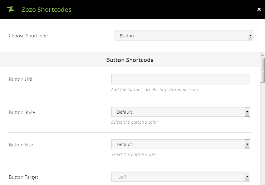
  • URL – The link you want the button to direct to, including http://. For example, http://www.example.com/.
  • Style – This option allows you choose the color of your button: Default, Blue, Custom, Light Blue, Green, Orange, Red.
  • Size – This option allows you choose the size of your button: Default, Wide, Extra Small, Small, Large.
  • Target – You can choose one of these option such as _self [Open in same window], _blank [Open in new window]
  • Text – Add the Text for your button.
  • Background Color – Button Background Color only works if choosed “Custom” style for button.
  • Background Hover Color – Button Background Hover Color. It only works if choosed “Custom” style for button.
  • Text Color – You can choose button Text Color. Leave blank for default.
  • Text Hover Color – You can choose button Text Hover Color. Leave blank for default.
  • Width – You can Enter border width for button. Ex: 2 or 3.
  • Border Color – You can add Button Border Color. Leave blank for default.
  • Border Hover Color – You can add Button Border Hover Color. Leave blank for default.
  • Extra Class – You can add Add the extra class to customize the button.
  • Select Icon – You can add a font awesome icon value. For example, Select Icon fa-times. Click an icon to select, click again to deselect.
  • Icon Position – You can select the position of icon such as left or right.
Sample Button

Button Output

Circle Counters

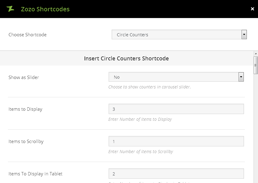
  • Show as Slider – This option allows you to choose slider to show counters in it.
  • Items to Display – This option allows you enter number of items to Display.
  • Items to Scrollby – This option allows you enter number of items to Scrollby.
  • Items To Display in Tablet – Enter Number of items to Display in Tablet.
  • Items To Display In Mobile Landscape – Enter Number of items to Display in Mobile Landscape.
  • Items To Display In Mobile Portrait – Enter Number of items to Display in Mobile Portrait.
  • Enable Navigation – You can enable navigation for slider.
  • Enable Pagination – You can enable pagination for slider.
  • Auto Play – Select to enable autoplay for slider.
  • Timeout Duration – You can select Timeout Duration for slider.
  • Margin ( Items Spacing ) – You can add spacing between items.
  • Column Size – You can add the width of the counter.
  • Circle Size – Enter Circle Size. Ex: 220 or 150 ( Only Numbers ).
  • Circle Line Width – You can enter Circle Line Width. Ex: 15 ( Only Numbers ).
  • Circle Text Color – Choose Counter Text Color.
  • Counter Description Color – Choose Counter Description Color.
  • Counter Value – You can enter the counter value from 1 to 100.
  • Counter Bar Color – You can select counter bar color.
  • Enter Title – You can add title for your counter.
  • Extra Class – You can add extra class for your counter.
  • Description – You can enter the description for your counter.

Counter1

Sample Description

Counter2

Sample Description

Counter3

Counter Description

Counter4

Sample Description
Columns

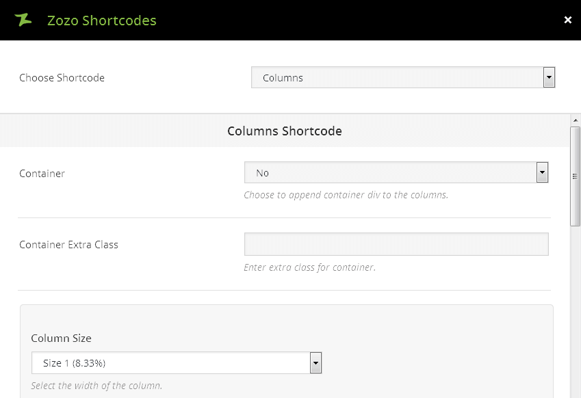
  • Container – This option allows you to Choose to append container div to the columns.
  • Container Extra Class – This option allows you add extra class for container.
  • Column Size – This option allows you to Select the width of the column.
  • Column Content – Add the column content.
  • Column Extra Class – Enter extra class for column.
1st Column Lorem ipsum dolor sit amet, consectetur adipisicing elit, sed do eiusmod tempor incididunt ut labore et dolore magna aliqua. Ut enim ad minim veniam, quis nostrud exercitation ullamco laboris nisi ut aliquip ex ea commo do consequat.
2nd Column Lorem ipsum dolor sit amet, consectetur adipisicing elit, sed do eiusmod tempor incididunt ut labore et dolore magna aliqua. Ut enim ad minim veniam, quis nostrud exercitation ullamco laboris nisi ut aliquip ex ea commo do consequat.
3rd Column Lorem ipsum dolor sit amet, consectetur adipisicing elit, sed do eiusmod tempor incididunt ut labore et dolore magna aliqua. Ut enim ad minim veniam, quis nostrud exercitation ullamco laboris nisi ut aliquip ex ea commo do consequat.

Columns Output

Contact Form

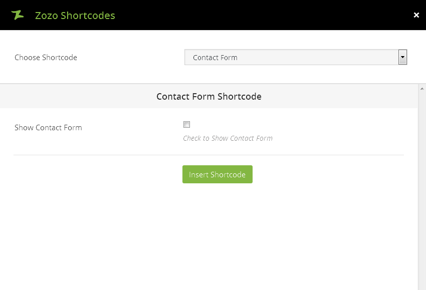
  • Show Contact Form – This option allows you to Show Contact Form. You can just click the check box to show the contact form.

Contact Form Output

Dropcap

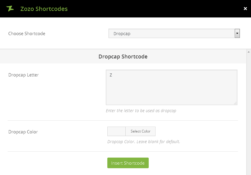
  • Dropcap Letter – Enter the letter to be used as dropcap
  • Dropcap Color – Select Dropcap Color or Leave blank for default.

Z

adipisicing elit, sed do eiusmod tempor incididunt ut labore et dolore magna aliqua. Ut enim ad minim veniam, quis nostrud exercitation ullamco laboris nisi ut aliquip ex ea commo do consequat. Lorem ipsum dolor sit amet, consectetur adipisicing elit, sed do eiusmod tempor incididunt ut labore et dolore magna aliqua. Ut enim ad minim veniam, quis nostrud exercitation ullamco laboris nisi ut aliquip ex ea commo do consequat.
Dropcap Output

Client/Brands

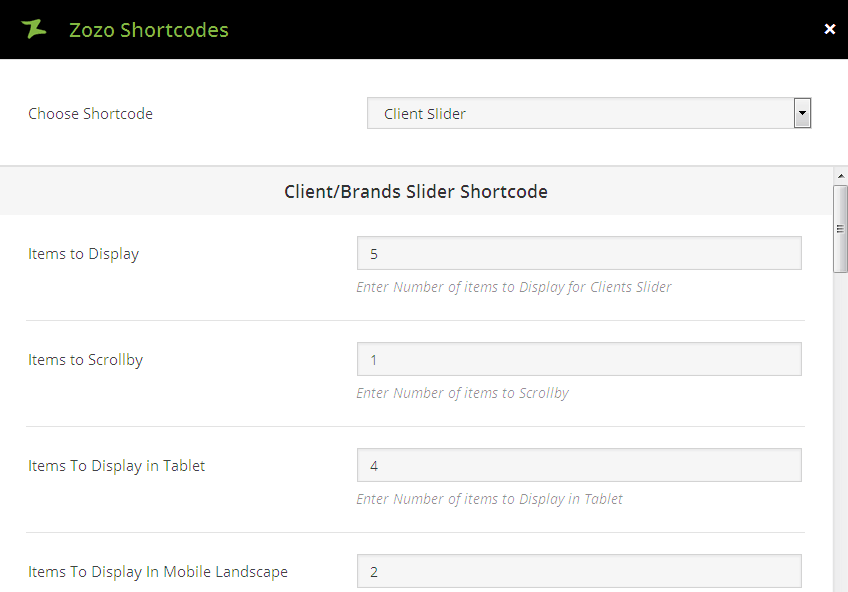
  • Items to Display – This option allows you enter number of items to Display.
  • Items to Scrollby – This option allows you enter number of items to Scrollby.
  • Items To Display in Tablet – Enter Number of items to Display in Tablet.
  • Items To Display In Mobile Landscape – Enter Number of items to Display in Mobile Landscape.
  • Items To Display In Mobile Portrait – Enter Number of items to Display in Mobile Portrait.
  • Enable Navigation – You can enable navigation for slider.
  • Enable Pagination – You can enable pagination for slider.
  • Auto Play – Select to enable autoplay for slider.
  • Timeout Duration – You can select Timeout Duration for slider.
  • Margin ( Items Spacing ) – You can add spacing between items.
  • Infinite Loop ( Items Spacing ) – Select to enable Infinite Loop for slider.
  • Image Alt Text – If an image cannot be viewed the alt attribute text will be shown.
  • Client/Brand Link – Add the client’s/brand’s website url. Ex: http://example.com.
  • Link Target – You can choose one of these option such as _self [Open in same window], _blank [Open in new window].
  • Link Target – You can choose one of these option such as _self [Open in same window], _blank [Open in new window].

Client/Brands Output

Counters

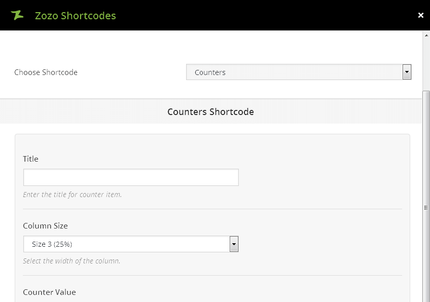
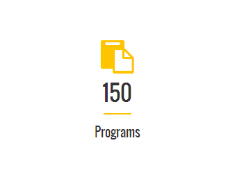
  • Title – Enter the title for counter item.
  • Column Size – Select the width of the column.
  • Counter Value – This option allow you to Enter counter value.
  • Select Icon – Click an icon to select, click again to deselect from the icon showing lists.
  • Icon Size – Enter Icon size for the icon choosed in counters. Ex: 30px.
  • Icon Color – You can choose the icon color from this option and leave blank for default icon color.
  • Icon Background Color – You can choose the icon background color from this option and leave blank for default icon color.
  • Title Color – You can choose the Title Color from this option and leave blank for default icon color.

Programs

Counters Output

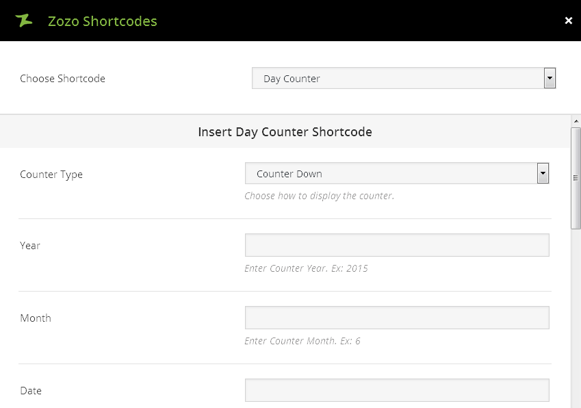
Day Counter

  • Counter Type – Choose how to display the counter such as Counter Up, Counter Down.
  • Year – This option allow you to Enter Counter Year. Ex: 2015.
  • Month – This option allow you to Enter Counter Month. Ex: 6.
  • Date – This option allow you to Enter Counter Date. Ex: 20.
  • Show Button – Choose to show button for Counter.
  • Button Text – You can Enter button text.
  • Button Link – You can Enter button link.
  • Extra Class – You can Enter extra class for Day Counter.

Counters Output

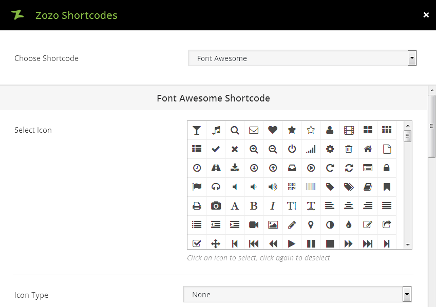
Font Awesome

  • Select Icon – This option allows you to choose the icon. Metal includes the font awesome icons and in option, click an icon to select, click again to deselect.
  • Type – Choose to display of icon such as none, circle, square. If “none” background and border icon wont displayed.
  • Style – Choose icon style such as light, dark, bordered, transparent.
  • Size – Select the size of the icon Small, Medium, Large, Extra Large.
  • Color – You can choose color for your icon and leave blank for default color.
  • Background Color – You can choose background color for your icon and leave blank for default color.
  • Border Color – You can choose border color for your icon and leave blank for default color.
  • Border Width – You can add border width for icon. Ex: 2 or 3.

Font Awesome Output

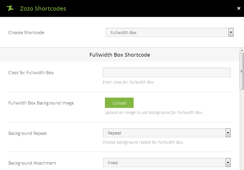
Fullwidth Box

  • Class for Fullwidth Box – This option allows you to Enter class for Fullwidth Box.
  • Fullwidth Box Background Image – Upload an image to use background for Fullwidth Box.
  • Background Repeat – Choose background repeat options for Fullwidth Box.
  • Background Attachment – Choose background attachment options for Fullwidth Box.
  • Fullwidth Box Background Color – You can choose Choose Fullwidth Box Background Color.
  • Overlay – You can Choose Overlay color.
  • Overlay Opacity – You can Enter Overlay Opacity. Values from 0.1 to 1. Ex: 0.1 or 0.3 or 1.
  • Background Overlay Color – You can Choose Fullwidth Background Overlay Color.
  • Padding Top – You can add Padding Top for Section. Ex: 20px.
  • Padding Bottom – You can add Padding Bottom for Section. Ex: 20px.
  • Content – You can add content for the Fullwidth Box.
We are currently working on a new website and won't take long. Please don't forget to check out our tweets and to subscribe to be notified! Lorem ipsum dolor sit amet, consectetuer adipiscing elit. Aenean commodo ligula eget dolor. Aenean massa. Cum sociis natoque penatibus et magnis dis parturient montes, nascetur ridiculus mus.

Fullwidth Output

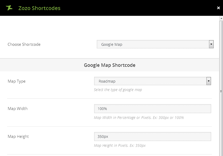
Google Map

  • Type – Select the type of google map such as RoadMap, Satellite, Hybrid, Terrain.
  • Width – You can set the Map Width in Percentage or Pixels. Ex: 300px or 100%.
  • Height – You can set Map Height in Pixels. Ex: 350px.
  • Zoom Level – This allows you to set zoom option and set Higher number will be more zoomed in.
  • Show Map Address on Click – Display map address tooltip by clicking marker in the map.
  • Enable Map Scrollwheel – You can enable zooming using a mouse’s scroll wheel.
  • Show Map Scale Control – This option allows you to set scale for the map.
  • Show Pan Control – Displays pan control on Map.
  • Marker Image – You can add upload an marker image to display marker on your locations.
  • Address – Add address to show marker on map. To show multiple marker locations on map, to separate addresses by using | symbol. Ex: Address 1 | Address 2.
[zozo_map address="Address" type="roadmap" width="100%" height="150px" zoom="5" onclick="yes" scrollwheel="yes" scale="yes" zoom_pancontrol="yes" marker=""]

Google Map Output

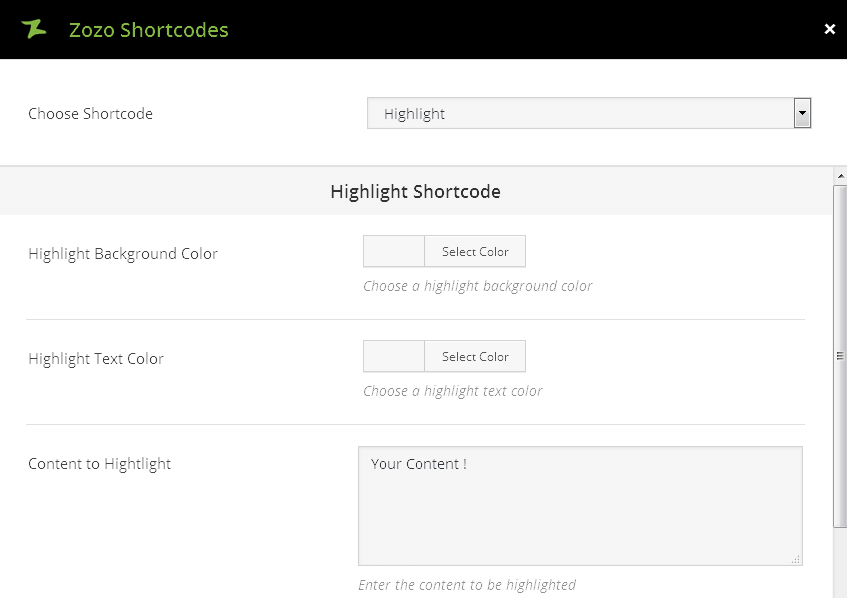
Highlight

  • Highlight Background Color – Choose a highlight background color.
  • Highlight Text Color – Choose a highlight text color.
  • Content to Hightlight – Your Content ! Enter the content to be highlighted.
Lorem ipsum dolor sit amet, consectetuer adipiscing elit. Aenean commodo ligula eget dolor. Aenean massa. Cum sociis natoque penatibus et magnis dis parturient montes, nascetur ridiculus mus.

Highlight Output

HTML Block

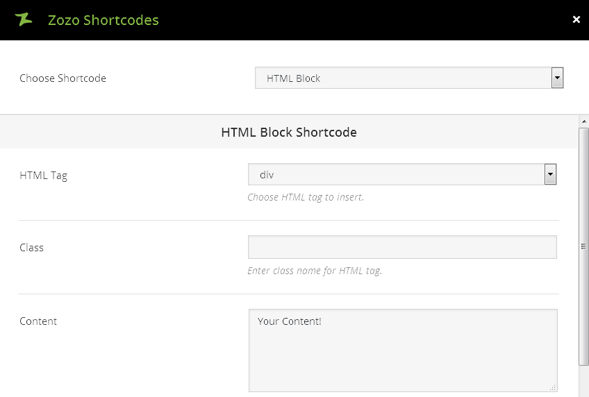
  • HTML Tag – Choose HTML tag to insert such as div, section, p , span.
  • Class – Enter class name for HTML tag.
  • Content – Enter the content for your Html block.
We are currently working on a new website and won’t take long. Please don’t forget to check out our tweets and to subscribe to be notified! Lorem ipsum dolor sit amet, consectetuer adipiscing elit. Aenean commodo ligula eget dolor. Aenean massa. Cum sociis natoque penatibus et magnis dis parturient montes, nascetur ridiculus mus.

HTML Block Output

Icons

Select Icon – This option allows you to choose the icon. Metal includes different icon lists, click an icon to select, click again to deselect.
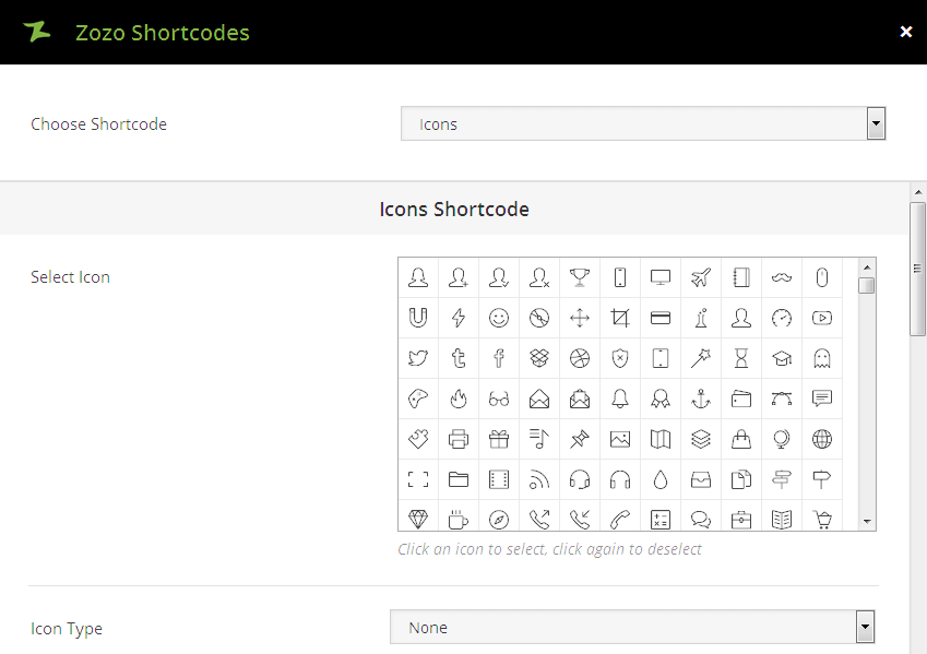
  • Type – Choose to display of icon such as none, circle, square. If “none” background and border icon wont displayed.
  • Style – Choose icon style such as light, dark, bordered, transparent.
  • Size – Select the size of the icon Small, Medium, Large, Extra Large.
  • Color – You can choose color for your icon and leave blank for default color.
  • Background Color – You can choose background color for your icon and leave blank for default color.
  • Border Color – You can choose border color for your icon and leave blank for default color.
  • Border Width – You can add border width for icon. Ex: 2 or 3.

Icons Output

Image Frame

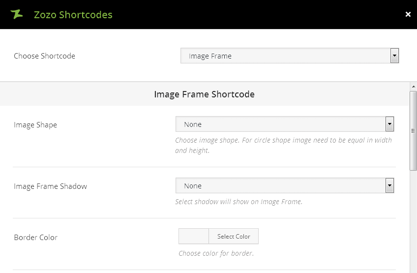
  • Image Shape – Choose image shape such as Angle Shape, Rounded Corners, Circle, Border. For circle shape image need to be equal in width and height.
  • Image Frame Shadow – This option allow you to Select shadow will show on Image Frame. Shadows such as Drop Shadow, Bottom Curved Shadow, Rounded Drop Shadow.
  • Border Color – This option allow you choose color for border.
  • Border Width – This option allow you to enter border width for image. Ex: 2 or 3.
  • Lightbox Image – You can choose to Show image in Lightbox.
  • Upload Image – Upload an image to display in the frame.
  • Image Alt Text – If an image cannot be viewed the alt attribute text will be shown.
Image

Icons Output

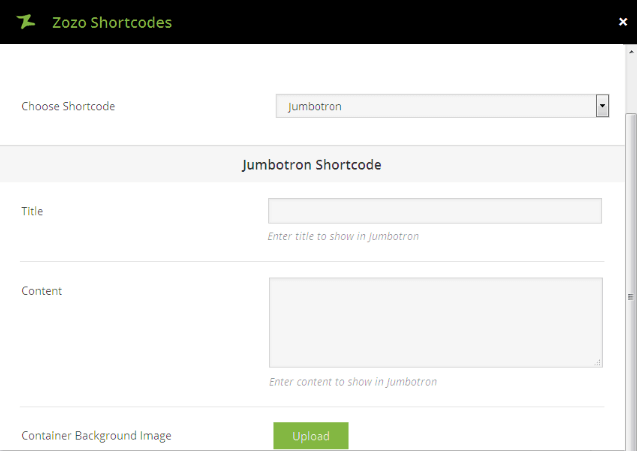
Jumbotron

  • Title – Enter title to show in Jumbotron.
  • Content – Enter content to show in Jumbotron.
  • Container Background Image – Upload an image to use background for container. Leave blank for default.
  • Background Repeat – Choose background repeat for container such as Repeat, Repeat -X, Repeat -Y, No Repeat.
  • Container Background Color – You can choose Container Background Color.
  • Container Text Color – You can choose Container Text Color.
  • Border Radius – Enter border radius. Ex: 2px or 50%.
  • Show Button – You can choose to show button with custom link.
  • Button Text – This options allows you to enter the text for your button.
  • Button Link – This options allows you to add link for your button.
  • Link Target – You can choose one of these option such as _self [Open in same window], _blank [Open in new window].
  • Button Size – You can select button size such as Default, Extra Small, Small, Large.
  • Button Background Color – Add Background Color for your button.
  • Button Background Hover Color – Add Background Hover Color for your button.
  • Button Text Color – Add Button Text Color. Leave blank for default.
  • Icon Position – You can align the button such as Left or Right.
  • Button Text Hover Color – Add Button Text Hover Color.
  • Select Icon – This option allows you to choose the icon for the button. click an icon to select, click again to deselect.

Page Title

We are currently working on a new website and won’t take long. Please don’t forget to check out our tweets and to subscribe to be notified! Lorem ipsum dolor sit amet, consectetuer adipiscing elit. Aenean commodo ligula eget dolor. Aenean massa. Cum sociis natoque penatibus et magnis dis parturient montes, nascetur ridiculus mus.

sample button

Jumbotron Output

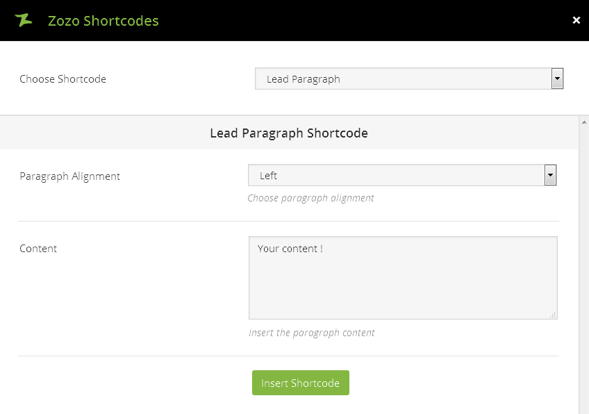
Lead Paragraph

  • Paragraph Alignment – Choose paragraph alignment such as left, Right, Center, Justify.
  • Content – You can insert the paragraph content.

We are currently working on a new website and won’t take long. Please don’t forget to check out our tweets and to subscribe to be notified! Lorem ipsum dolor sit amet, consectetuer adipiscing elit. Aenean commodo ligula eget dolor. Aenean massa. Cum sociis natoque penatibus et magnis dis parturient montes, nascetur ridiculus mus.

Lead Paragraph Output

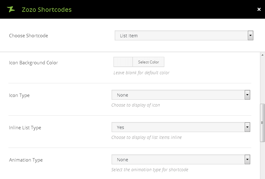
List Item

  • Select Icon – This option allows you to choose the icon. Metal includes different icon lists, click an icon to select, click again to deselect.
  • Icon Color – You can choose color for your icon and leave blank for default color.
  • Icon Background Color – You can choose Background color for your icon and leave blank for default color.
  • Icon Type – Choose to display of icon such as none, circle, square. If “none” background and border icon wont displayed.
  • Inline List Type – You can choose to display of list items inline.
  • List Item Content – Enter the list item content.
We are currently working on a new website and won’t take long. Please don’t forget to check out our tweets and to subscribe to be notified! Lorem ipsum dolor sit amet, consectetuer adipiscing elit. Aenean commodo ligula eget dolor. Aenean massa. Cum sociis natoque penatibus et magnis dis parturient montes, nascetur ridiculus mus. We are currently working on a new website and won’t take long. Please don’t forget to check out our tweets and to subscribe to be notified! Lorem ipsum dolor sit amet, consectetuer adipiscing elit. Aenean commodo ligula eget dolor. Aenean massa. Cum sociis natoque penatibus et magnis dis parturient montes, nascetur ridiculus mus.

List Item Output

Modals

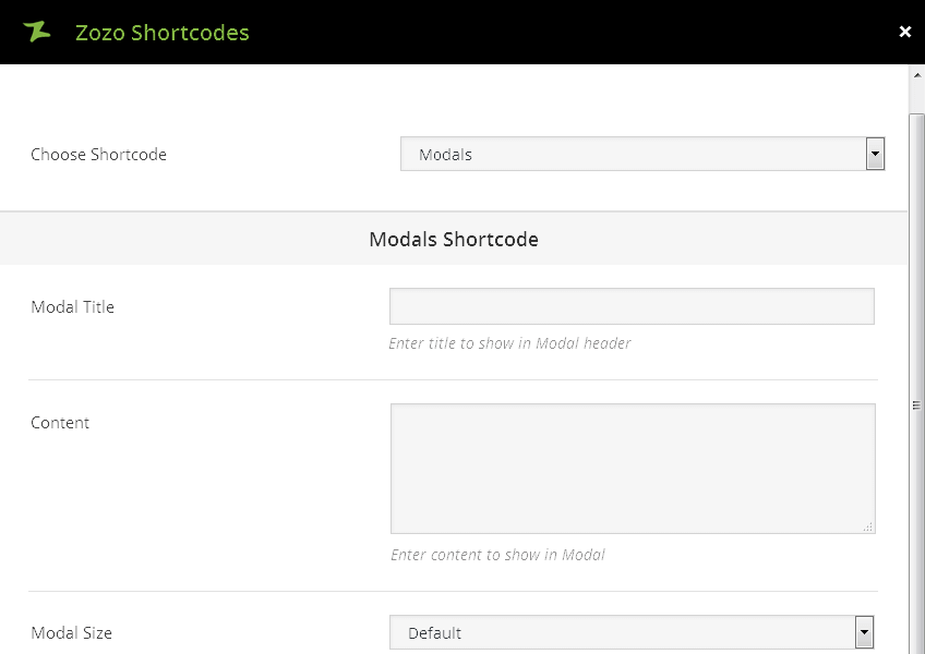
  • Modal Title – Enter title to show in Modal header.
  • Content – Enter content to show in Modal
  • Modal Size – Choose modal size such as Default, Small, Large.
  • Button Size – You can select button size such as Default, Extra Small, Small, Large.
  • Button Text – Enter button text to open modal window by clicking it.
  • Button Background Color – Add button Background Color.
  • Button Background Hover Color – Add button Background Hover Color.
  • Button Text Color – Button Text Color. Leave blank for default.
  • Button Text Hover Color – Button Text Hover Color. Leave blank for default.
  • Select Icon – This option allows you to choose the icon, click an icon to select, click again to deselect.
  • Icon Position – You can select the position of icon such as left or right.

Modals Output

Page Header

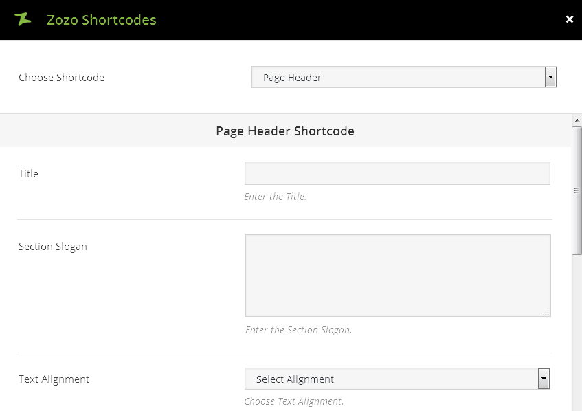
  • Title – Enter title to show in Page header.
  • Section Slogan – Enter the Section Slogan to show after Page header.
  • Text Alignment – Choose Text Alignment such as Left, Right, Center.
  • Title Color – Choose title color. Leave blank for default.
  • Slogan Color – Choose page slogan color. Leave blank for default.

Page Header

Slogan

Page Header Output

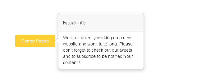
Popover

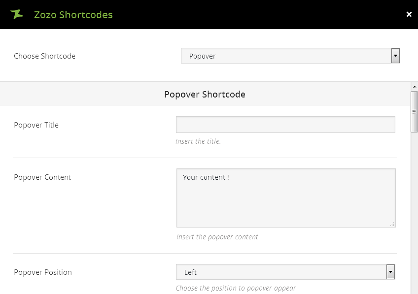
  • Popover Title – Enter title to show in Popover.
  • Popover Content – Insert the content to show in Popover.
  • Popover Position – Choose the position to popover appear as Left, Right, Top, Bottom.
  • Popover Show – Choose when popover needs to activate. By “Click” on popover show wont work with Link type.
  • Link or Button Text – Option allow you to insert the link or button text.
  • Link or Button URL – Option allow you to insert the link for text.
  • Link or Button Target – You can choose one of these option such as _self [Open in same window], _blank [Open in new window].
  • Button Size – You can select button size such as Default, Extra Small, Small, Large.
  • Button Background Color – Add Background Color for your button.
  • Button Background Hover Color – Add Background Hover Color for your button.
  • Button Text Color – Add Button Text Color. Leave blank for default.
  • Button Text Hover Color – Add Button Text Hover Color.
  • Select Icon – This option allows you to choose the icon for the button. click an icon to select, click again to deselect.
  • Icon Position – You can align the button such as Left or Right.

Popover Output

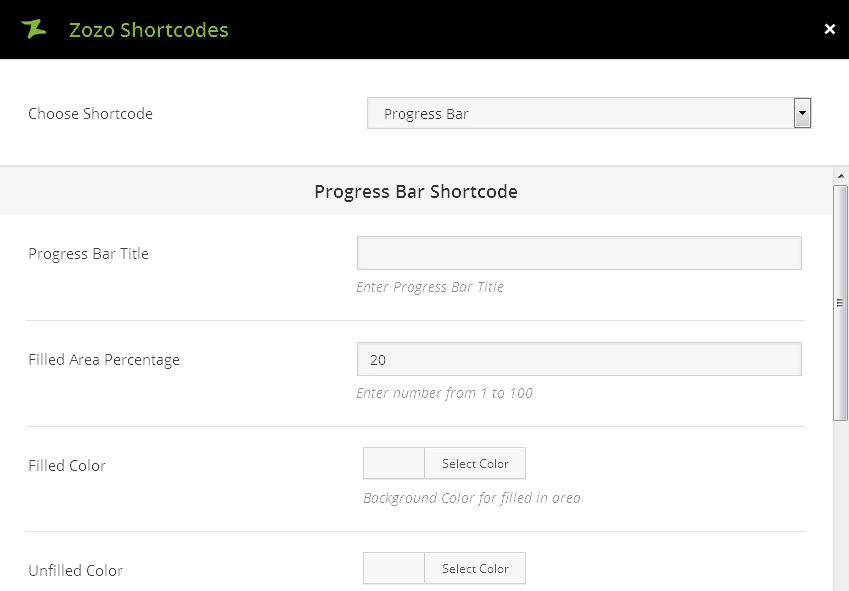
Progress Bar

  • Progress Bar Title – Enter title to show in Progress Bar.
  • Filled Area Percentage – Enter number from 1 to 100 for area percentage.
  • Filled Color – This options allows you to add Background Color for filled in area.
  • Unfilled Color – This options allows you to add Background Color for unfilled area
  • Enable Striped Animation – Choose to enable striped animation on Progress Bars.
  • Progress Bar Text – Enter the text to show in progress bar.
Progress1Html
Progress2CSS
Progress3Wordpress

Progress Bar Output

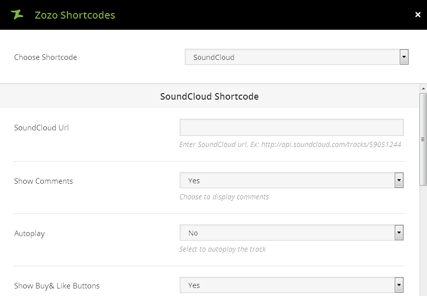
SoundCloud

  • SoundCloud Url – Enter SoundCloud url, For Ex: http://api.soundcloud.com/tracks/59051244.
  • Show Comments – This option allow you to enable/disable display comments.
  • Autoplay – You can select to enable/Disable autoplay the track.
  • Show Buy& Like Buttons – This option allow you to select to show/hide buy & like buttons.
  • Show Artwork – Select to show/hide artwork from this option.
  • Color – You can select the color for play button and other controls.
  • Width – Enter player width in pixels or percentage. Ex: 100% or 500px.
  • Height – Enter player height in pixels. Ex: 110.

SoundCloud Output

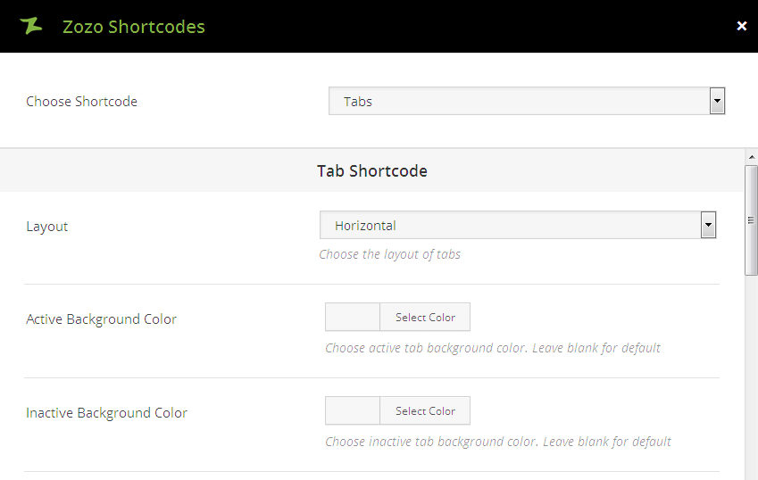
Tabs

  • Layout – Choose the layout of tabs such as Horizontal, Vertical Left, Vertical Right.
  • Active Background Color – Choose active tab background color. Leave blank for default.
  • Inactive Background Color – Choose inactive tab background color. Leave blank for default.
  • Tab Title – This option allow you add Title for the tab.
  • Select Icon – Select icon to show before tab title. Click an icon to select, click again to deselect.
  • Icon & Title Color – Choose icon and tab title color. Leave blank for default.
  • Tab Content – This option allow you to add the tabs content.

We are currently working on a new website and won’t take long. Please don’t forget to check out our tweets and to subscribe to be notified! Lorem ipsum dolor sit amet, consectetuer adipiscing elit. Aenean commodo ligula eget dolor. Aenean massa. Cum sociis natoque penatibus et magnis dis parturient montes, nascetur ridiculus mus.

We are currently working on a new website and won’t take long. Please don’t forget to check out our tweets and to subscribe to be notified! Lorem ipsum dolor sit amet, consectetuer adipiscing elit. Aenean commodo ligula eget dolor. Aenean massa. Cum sociis natoque penatibus et magnis dis parturient montes, nascetur ridiculus mus.

We are currently working on a new website and won’t take long. Please don’t forget to check out our tweets and to subscribe to be notified! Lorem ipsum dolor sit amet, consectetuer adipiscing elit. Aenean commodo ligula eget dolor. Aenean massa. Cum sociis natoque penatibus et magnis dis parturient montes, nascetur ridiculus mus.

Tabs Shortcode Output

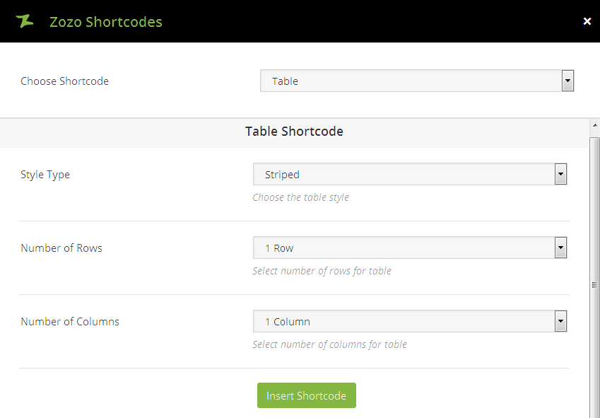
Table

  • Style Type – Choose the table style such as Striped, Bordered, Condensed.
  • Number of Rows – Select number of rows for table. You can choose upto 1-5 rows.
  • Number of Columns – Select number of columns for table. You can choose upto 1-5 columns.

Table Output

Tooltip

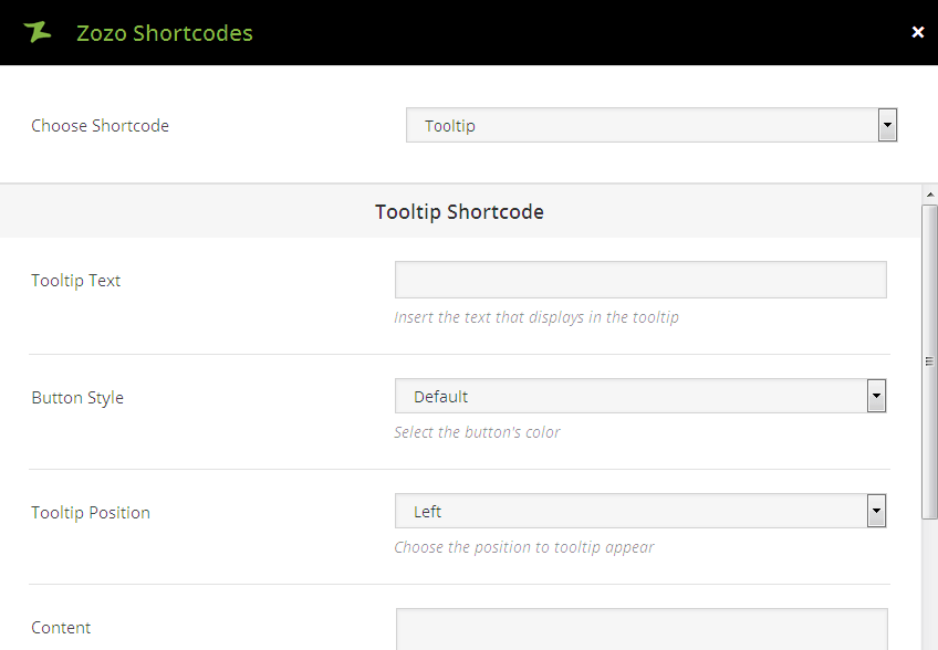
  • Tooltip Text – Insert the text that displays in the tooltip.
  • Button Style – Select the button’s color such as Default, Blue, Custom, Light Blue, Green, Orange, Red.
  • Tooltip Position – This option allows you to Choose the position to tooltip appear
  • Content – Insert the text that will activate the tooltip hover.
Tooltip1Tooltip2Tooltip3Tooltip4

Tooltip Output

Vimeo

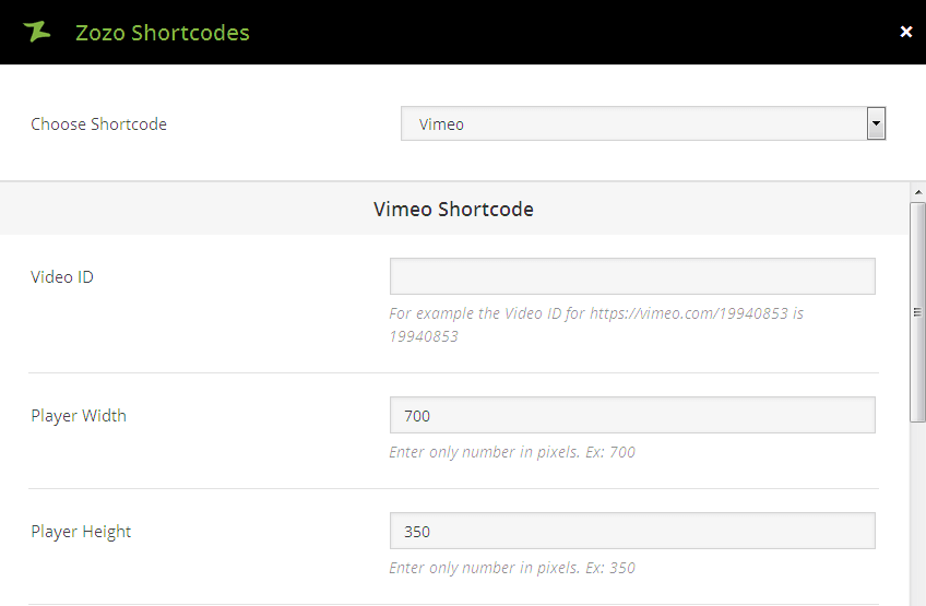
  • Video ID – For example the Video ID for https://vimeo.com/19940853 is 19940853.
  • Player Width – Enter only pixel value for the Player Width. Ex: 700.
  • Player Height – Enter only pixel value for the Player Height. Ex: 350.
  • Color – You can select the color for video controls.
  • Show Title – Select to show title in video.
  • Show Byline – Select to show user byline in video.

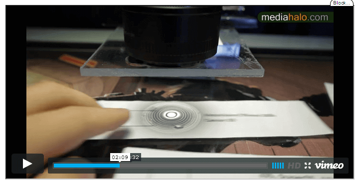
Vimeo Output

Youtube

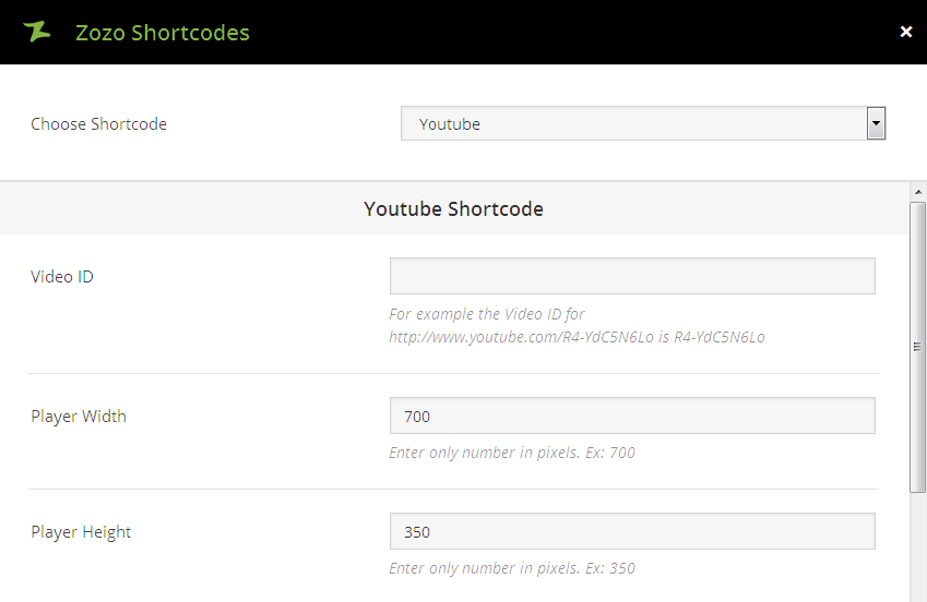
  • Video ID – For example the Video ID for http://www.youtube.com/R4-YdC5N6Lo is R4-YdC5N6Lo.
  • Player Width – Enter only pixel value for the Player Width. Ex: 700.
  • Player Height – Enter only pixel value for the Player Height. Ex: 350.
  • Related Videos – You have the option that select to show related videos.

Youtube Output

Shortcode Customization

You want to change something in this theme that requires some custom CSS to a specific element. You will need to give that element a unique class or ID. The following steps shows that how to add custom CSS.

Apply Custom CSS

  • To apply custom CSS to a specific element, Navigate to Theme Options > General > Custom CSS. You can Paste your custom CSS in the window [refer screenshot].
  • After you set the custom class or ID, we can then control the styling of that element by adding custom css that targets the class name. This CSS should be added to the the Custom CSS field in our Theme Options.