Thank you for purchasing our theme. We are happy that you are one of our customers and we assure you will not be disappointed. We do our best to produce top notch themes with great functionality, premium designs, and clear code.
With ThemeForest regular license you are licensed to use this theme to create one single End Product (the final website customized with your content) for yourself or for one client.
What is allowed with the single regular license:
What is not allowed:
For more information regarding license regulations and policies, see the links below:
IMPORTANT! We do not include theme-related .PSD files into the theme package, because it significantly increases the theme archive size. You will get all images and clip arts while importing demo.
In order to receive a technical support assistance, you need to have a valid purchase code. To get the code, please navigate to your ThemeForest "Downloads" page and click on the theme download link. Check this guide for more details.
PLEASE NOTE! As authors of this theme we do provide support only for the theme-related features.
We do not provide support for additional customization, 3rd party plug-ins integration or any other compatibility issues that might arise. Nevertheless, there is an exception that is only applied to the plug-in(s) we have developed and integrated ourselves.
If you have any questions that are beyond the scope of this help file, feel free to post them on our support message board (forum) at https://zozothemes.ticksy.com/. We will respond as soon as possible (within 24 – 48 hours, usually faster). We are open from 9am to 7pm (GMT), from Monday till Friday.
Please be aware that a lot of the questions that are posted in the forum have been posted many times before, and get the same answers each time. Before submitting a new ticket, please try searching the forum for an answer, as well as checking our Articles. The forum has its own inner search and also has been indexed by Google, so if you can not find your answer with a forum search, it is worth typing it into Google too. Please make sure you have looked at all the available resources before submitting a support request.
To install this theme you must have a working version of WordPress already installed. Below are some useful links regarding WordPress information.
PLEASE NOTE! The theme is designed for free WordPress version downloaded at WordPress.org. We do not guarantee the theme full compatibility with installations on Wordpress.com due to limitations in website control and theme customization.
To use this theme you must be running at least WordPress 4.9, PHP 5.6, mysql 5 or higher. If you use a hosting service with limited resources (e.g. GoDaddy!), you may experience issues with the "one-click" demo data installation.
We recommend that you contact your web hosting service provider to make sure that your server PHP configuration limits are as follows:
max_execution_time 500memory_limit 128Mpost_max_size 32Mupload_max_filesize 32Mmax_input_vars 2000If you are running unmanaged dedicated server or VPS,
you should check your php.ini file. Alternatively, you can edit .htaccess file in the root of your website and add the following values:
php_value max_execution_time 600php_value memory_limit 128Mphp_value post_max_size 32Mphp_value upload_max_filesize 32MSetting these values will ensure you will not get error messages during the installation. To safeguard your website, please use secure passwords and the latest version of WordPress and plug-ins.
Here is the list of web hosting service providers we recommend:
Before installing the theme, please make sure you unpacked the archive and extracted the theme files. Some of the folders names may slightly vary. Treat the screenshot below as an example only.
The main package contains archives with the main theme, child theme and documentation.
If you try to install the wrong files, you will get the missing styles.css error. This is the most common error that means you are trying to install an incorrect package.
In order to install the theme, you need to have a working version of WordPress installed on your server first. Check out this guide for detailed information on how to install WordPress. We also highly recommend updating your WordPress to the latest stable version.
PLEASE NOTE! The theme is designed for free WordPress version downloaded at WordPress.org. We do not guarantee the theme full compatibility with installations on Wordpress.com due to limitations in website control and theme customization.
There are 2 ways to install the theme:
stmichael.zip file and ONLY use the extracted /stmichael theme folder.stmichael theme folder into /wp-content/themes.stmichael.zip folder and click Install Now button.Attention! If you want to make changes in theme’s templates or functions, we recommend activating a child theme before demo data installation. Please see the Child Theme section for more information.
Below is the list of the plug-ins that come included into the theme.
All these plug-ins can also be installed from the WordPress.org repository and from Theme plugins.
To make the theme look exactly as on the demo page, you would need to install the recommended plug-ins:
All existing demo pages and layouts are built using Elementor Page Builder and should be customized using Elementor Page Builder only.
PLEASE NOTE! It is possible to switch between the page builders. Please use One page builder for creating/customizing One particular page/post/layout.
If you want to make changes to the theme's files and functions, we recommend installing a child theme. This ensures that your theme customizations stay in place after the theme update. If you are not planning to change the core theme files, you are free to skip this chapter.
IMPORTANT! Install the child theme before importing the demo data. Otherwise, all of your theme options will be reset.
A child theme is installed the same way you install a parent theme. Locate the stmichael-child.zip file in the theme package and upload it via the WordPress admin panel. Alternatively, you can unzip it and upload via FTP (see main theme installation chapter).
Your child theme has its own functions.php file. Use it to copy modified functions from the parent theme's functions.php, or register new functions.
This step is required if you received the notification that a new version of the theme is available. You can see this information in Change log section at the bottom of the item's details page.
Before you go ahead with the update make sure to backup your old theme's folder. Download it to your computer locally.
/wp-content/themes.themes folder.Now let's navigate to Appearance (WP dashboard) > Customize to flexibly control the appearance and behavior of the whole website as well as individual types of posts, pages and categories.

Moreover, you can see the changes of the front-end right after the alterations - when the needed parameter is selected, without switching from admin to front-end each time. When you are done with the changes, you should click on Publish button at the top of the Customizers side menu.
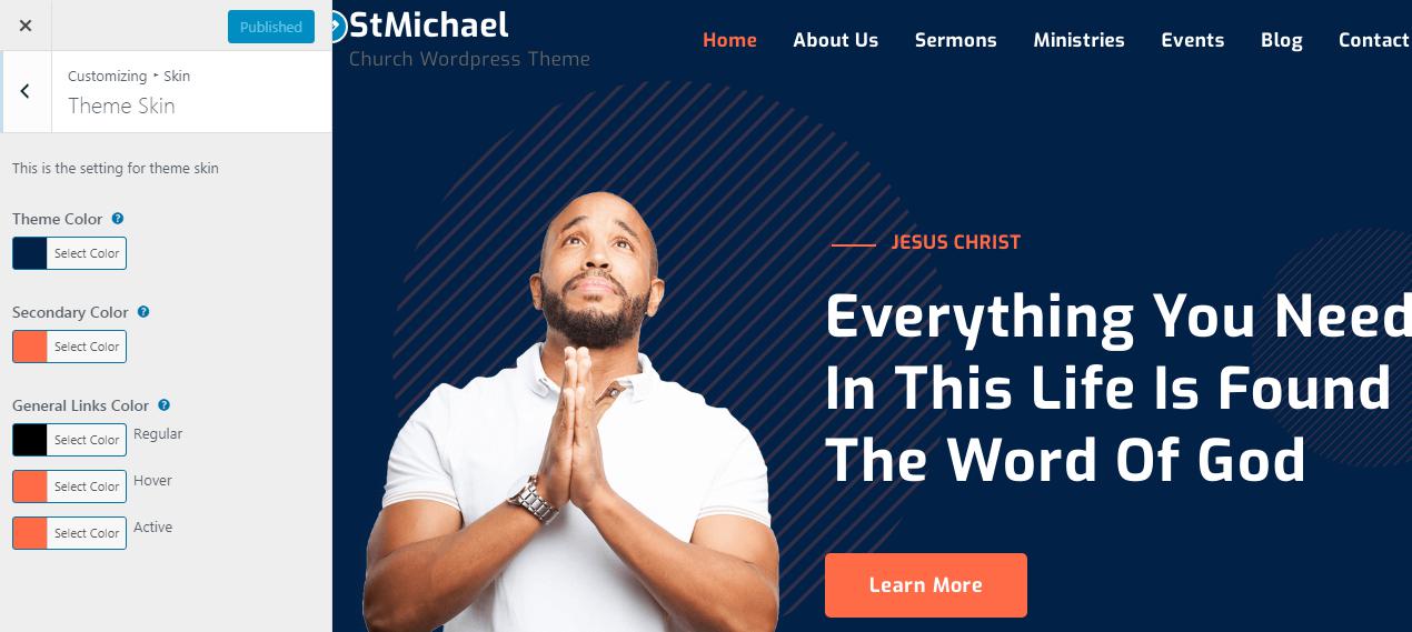
Settings of this group are responsible for managing an overall look of the site.
Here you can choose the Body layout style and View.
This is the setting for Upload a site logo.
Settings of this group are responsible for managing site identity features.
The text entered into this field appears as the logo title (if the image logo is not uploaded) and as the websites title in your browser tab.
The text entered into this field appears as the website slogan under the logo. By default, the tag line is used if no image logo is selected.
You can modify the site title and tag line appearance by inserting special characters, e.g.:
|| - line break;{{ ... }} - modifies style and color of parts of the text;[[ ... ]] - makes the text bold;The site icon (favicon) is used as a browser and app icon for your site. Icons must be square, and at least 512 pixels wide and tall. You can navigate favicon uploader Customizer >> Site Identity >> Site Icon Here you can upload your site favicon.
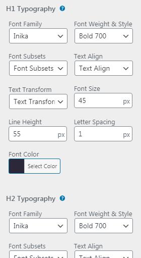
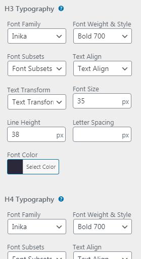
This is the setting for theme general typography
Customizer > StMichael Theme Options > Typography > General Typography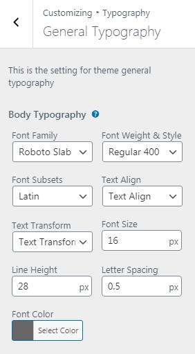
Settings of this group allow you to manage an overall look and behavior of the header elements In your website.
This is the setting for general header. Here you can change all of your header behavior like color , sizes , background , Items , Alignments etc..
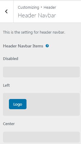
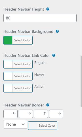
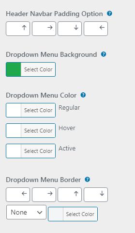
This is the setting for Header Navbar. Here you can change all of your header Navbar behaviors like fonts , color , sizes , background , Items , Alignments etc..
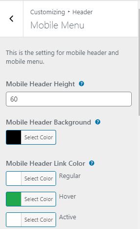
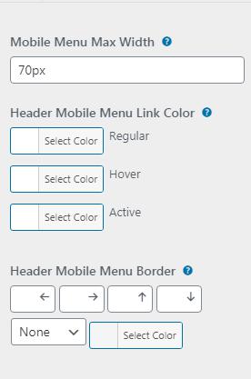
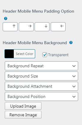
This is the setting for mobile header and mobile menu. Here you can change all of your header mobile Menu behaviours like color , sizes , background , Items , Alignmets etc..
Setting of this group is responsible for choosing the style of the footer area , Here you can change all of your Footer behaviors like color , sizes , background , Items , Alignments etc..
This is the setting for Footer. Here you can change all of your Footer behaviors like fonts , color , sizes , background , Items , Alignments etc..
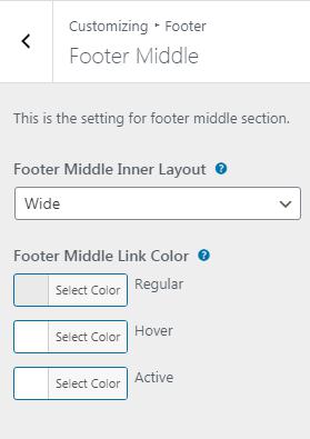
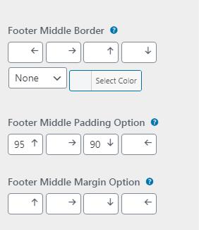
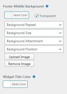
This is the setting for footer Middle section.
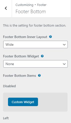
This is the setting for footer Bottom section.
Page template option Used to modify the behavior of the single page template. Here you can change the page template , Sidebars look and layouts, Page title bar options etc.
A custom post type is an additional type of posts that is tailored for a specific kind of content. Custom post types are a part of the Classic Elementor Add-ons plug-in. You can use them after the plug-in activation.


Here You Can Edit Service Single Page Options Dashboard > Classic Elementor > Plugin Options > Service.

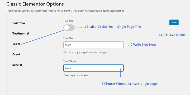
Here You Can Edit Team Single Page Options Dashboard > Classic Elementor > Plugin Options > Team.
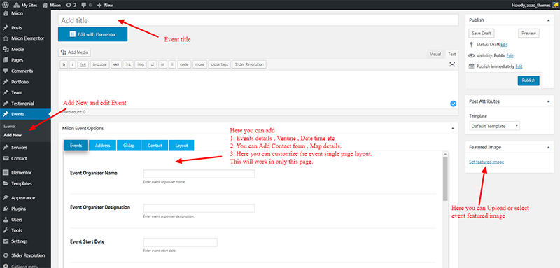

Here You Can Edit Event Single Page Options Dashboard > Classic Elementor > Plugin Options > Event.


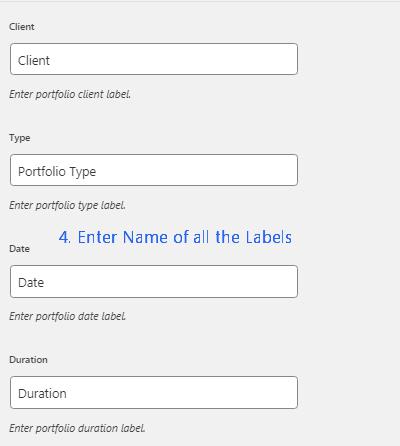


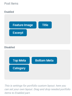
Here You Can Edit Service Single Page Options Dashboard > Classic Elementor > Plugin Options > Portfolio.


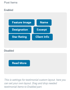
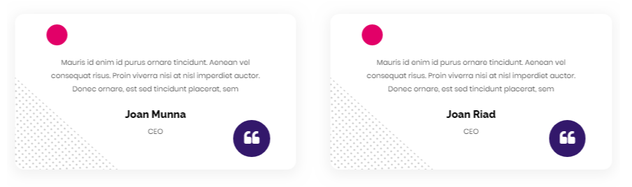
Here You Can Edit Service Single Page Options Dashboard > Classic Elementor > Plugin Options > Testimonial.
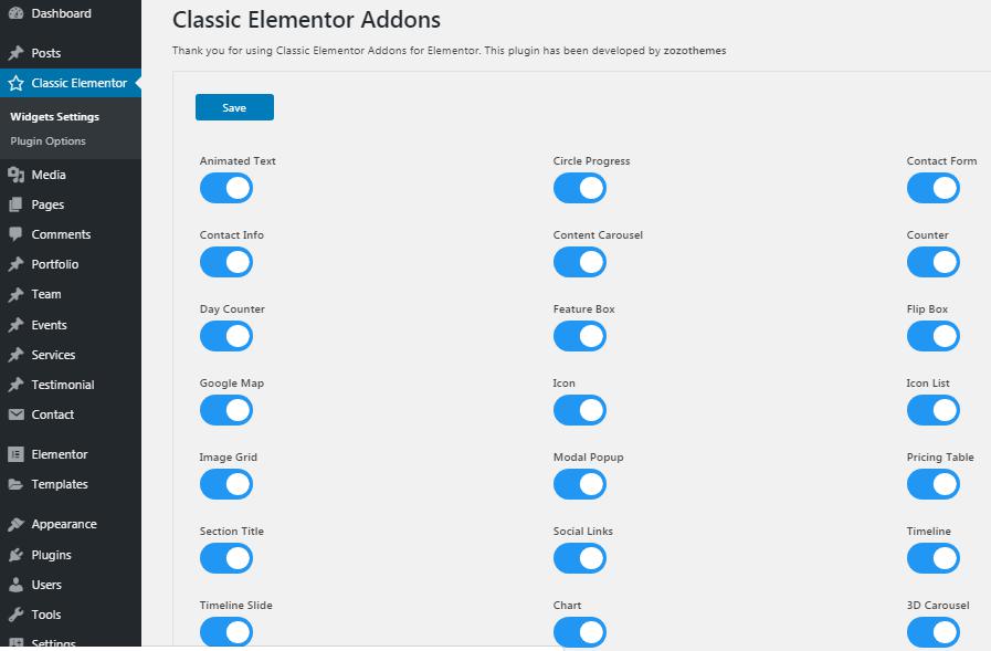
Here you can Activate and Deactivate Shortcodes here depends on your site requirements.


Activated Shortcode will display in Elementor Front End Editor Elements. You can use them.
This shortcode For to insert Animated text.
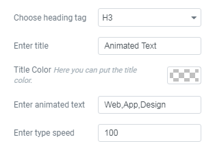
<h1>, <h2>, <h3>, <h4>, <h5>, <h6> HTML TagExample:


<h1>, <h2>, <h3>, <h4>, <h5>, <h6>Example:

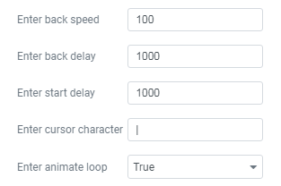
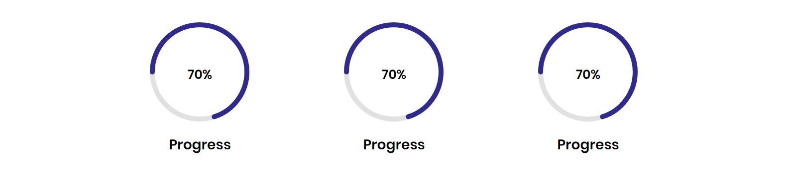
This shortcode displays Progress Bar in Circle Shape

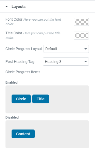
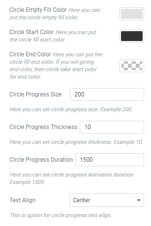
Example:
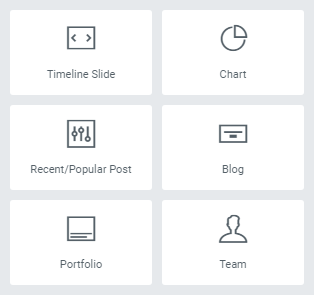
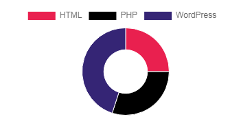
This shortcode displays Charts / Pie Charts / Line Charts.
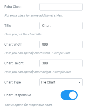

Example:

This shortcode displays a Different styles contact forms.


Example:

This shortcode used to display Contact informations like Address, Phone, Email and social details

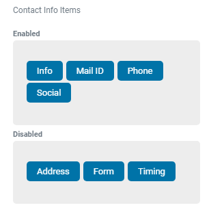
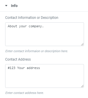
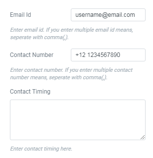


Example:

This shortcode is used to show Counters.

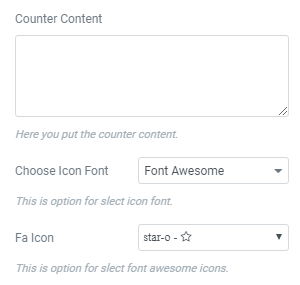


Example:

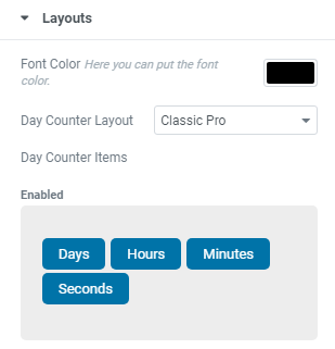
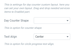
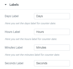
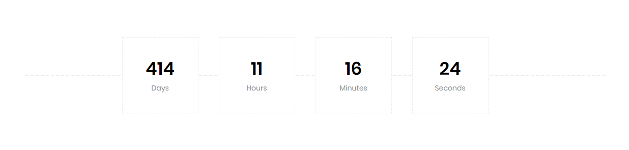
This shortcode displays countdown.
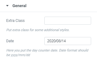
Example:
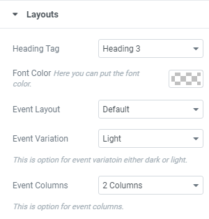
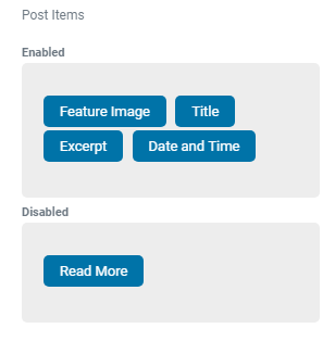
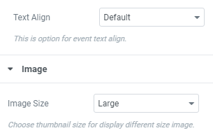
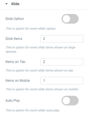
This shortcode displays Events. you can Customize Events in WordPress Dashboard >> Events >> Here you can Add new and Edit Existing Events


Example:

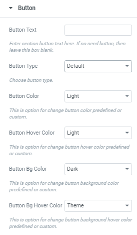
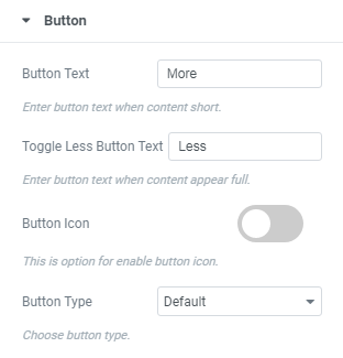
This Shortcode is used to display feature box , icon Box , Image Box and Video Box.


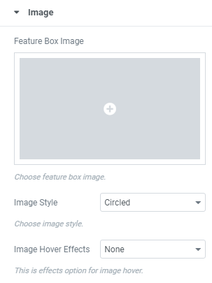

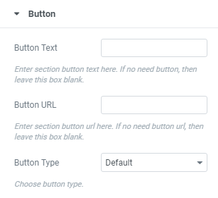
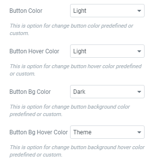

Example:

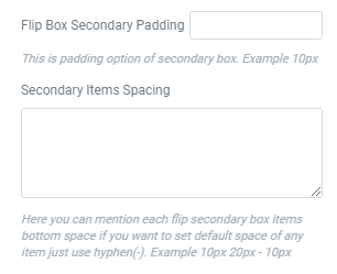
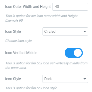
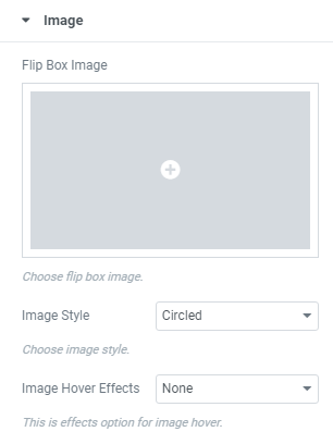
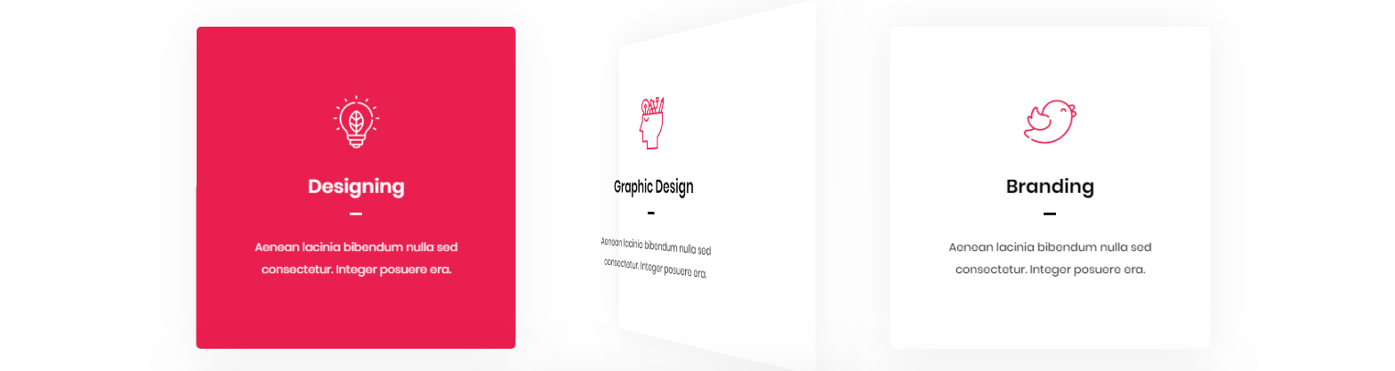
This shortcode Used to display Flip boxes


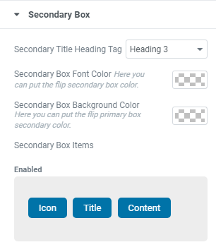


Example:
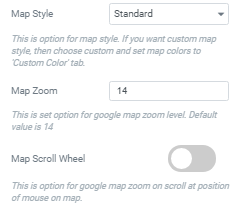
This shortcode displays a Google map. Make sure there is a valid API key in the "Google API key" field on the Customizer >> theme options >> General >> API tab.


Example:

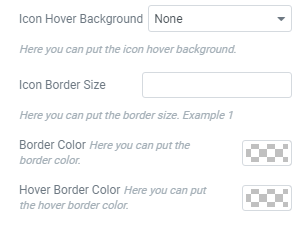
This shortcode used for to display icons with different styles.


Example:

This shortcode used for to display icons and Text
Example:
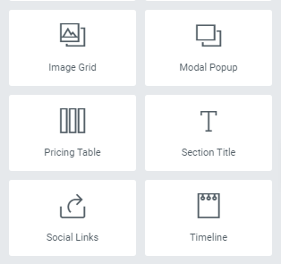
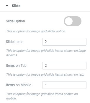
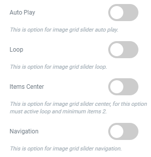
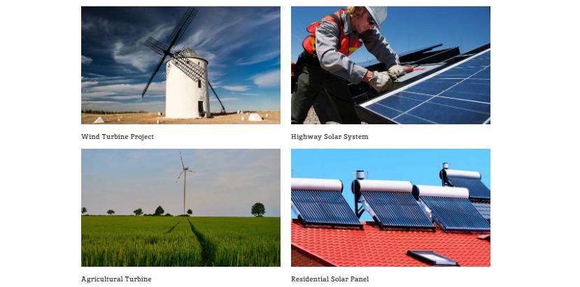
This shortcode used for to display Image grids / Clients / Clients sliders


Example:

This shortcode used to display mailchimp sign up.
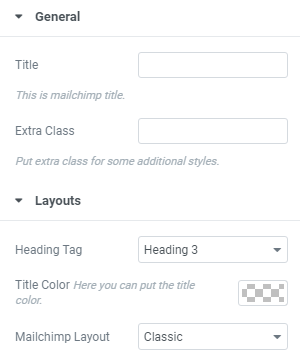


Example:
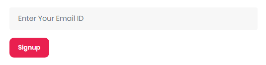
This shortcode used to display mailchimp signup.


Example:

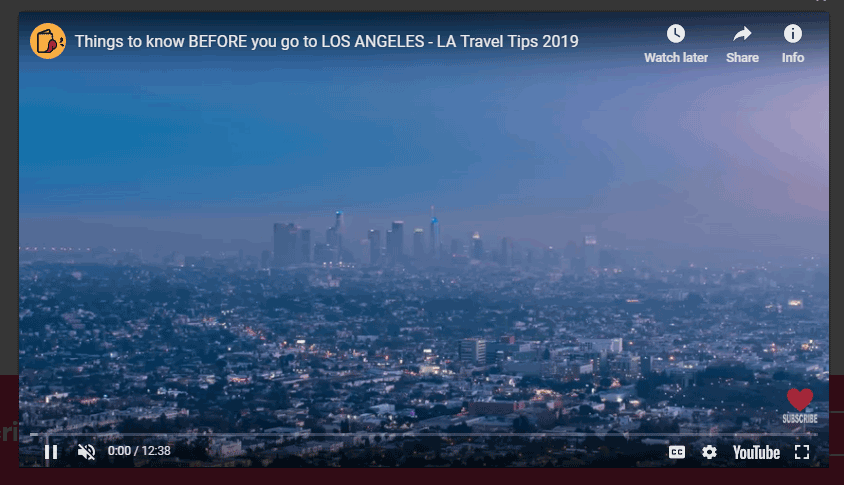
This shortcode used to display the frame Inside the you can display video , Forms , Website etc..
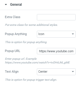

Example:
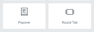
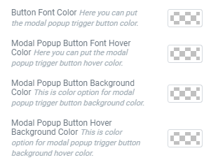
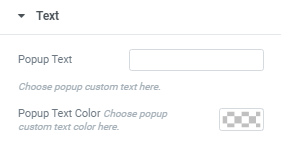
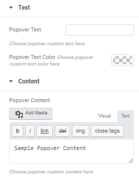
This shortcode used to display popover while click on Text, Icon , Image etc..
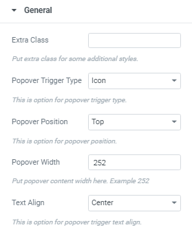
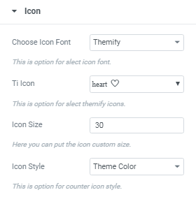
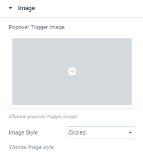

Example:

This shortcode used for to display icons and Text


Example:
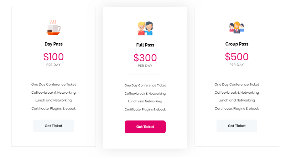
This shortcode displays Different styles of pricing table.
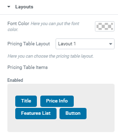
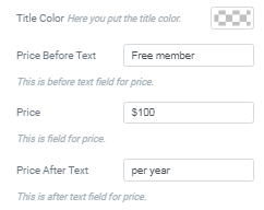
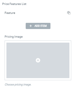
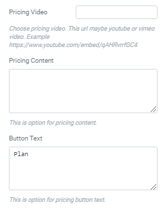
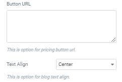
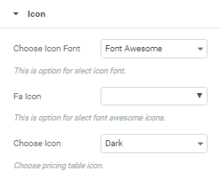
Example:
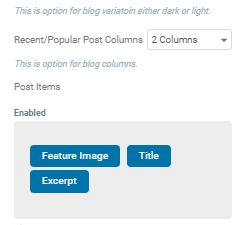
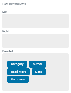
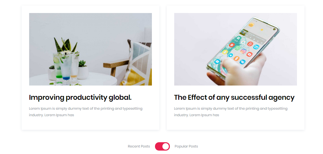
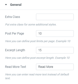
This shortcode displays Recent And popular Blog post.
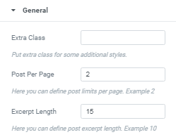


Example:
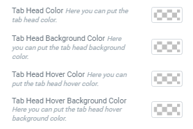
This shortcode used to display Rounded tab


Example:

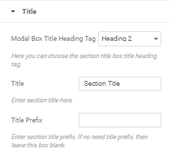
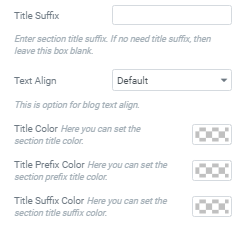
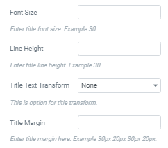
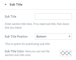
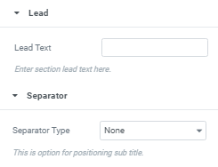
This shortcode displays Section title with different styles.

Example:
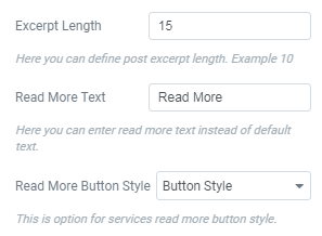
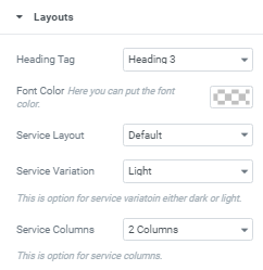
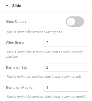
This shortcode displays Services with different styles.


Example:

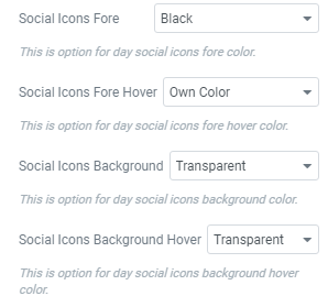
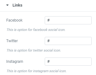
This shortcode displays Social Links with different styles.

Example:

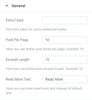
This shortcode displays Team Members with different styles.
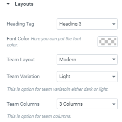


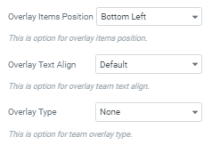
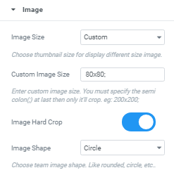

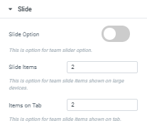

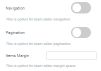

Example:

This shortcode displays Team Members with different styles.


Example:
This shortcode displays timeline.


Example:

This shortcode displays timeline.


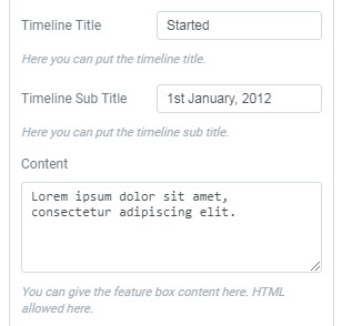
Example:

This shortcode displays Toggle Content option.

Example:

Contact Form 7 can manage multiple contact forms, plus you can customize the form and the mail contents flexibly with simple markup. The form supports Ajax-powered submitting, CAPTCHA, Akismet spam filtering and so on.
Check this link for more information. More guides are available here.
The theme comes with several pre-built contact forms that can be customized in Contact (WP Dashboard) > Contact Forms.

[contact-form-7 id="5" title="Contact form 1"]