
This shortcode For to Add the Mailchimp.
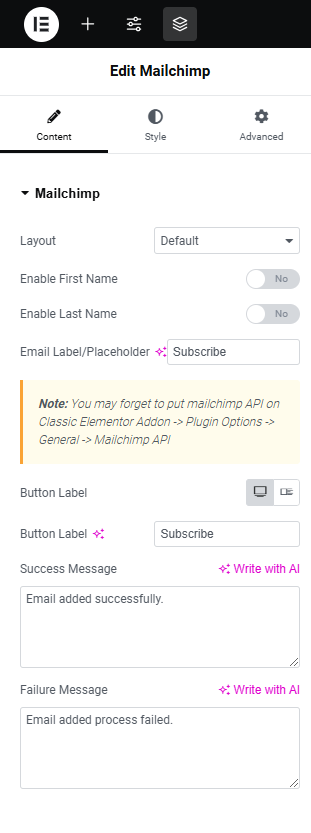
Mailchimp
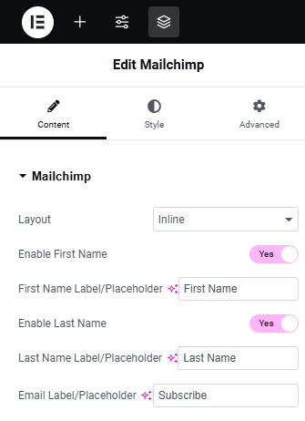
- Layout – Here you can choose the Default or Inline layout.
- Enable First Name – Here you can enable or disable the First Name.
- Enable Last Name – Here you can enable or disable the Last Name.
- Email Label/Placeholder – Here you can change or remove the Email label/placeholder text
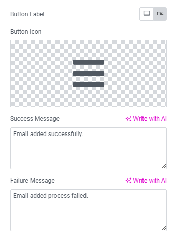
- Button Label – Here you can click change button label text or icon.
- Button Label – Here you can change or remove the Button Label text.
- Button Icon – Here you can change or remove the button icon.
- Success Message – Here you can change or remove the Success Message Text.
- Failure Message – Here you can change or remove the Failure Message Text.
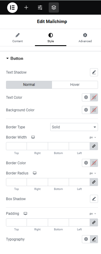
Style
Button
Here you can set Style for Mailchimp button Normal View and Hover View.-
- Text Shadow – Here you can set text shadow effect to the Button.
- Text Color – Here you can add text Color.
- Background Color – Here you can add Button Background Color.
- Border Type – This is option for selecting type of the border.
- Border Radius – This is an option to set a value for the button border radius.
- Box Shadow – Here you can Enable/Disable Button box shadow .
- Padding – Here you can set padding value for Button.
- Typography – Here you can customize the style, size, and arrangement of the text.
-
-
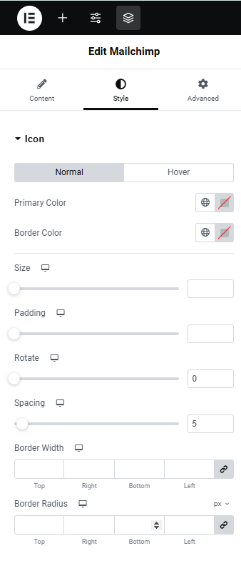
- Primary Color – Here you can change or remove the primary Color and hover color.
- Border Color – Here you can change or remove the Border Color and hover color.
- Padding – Here you can set padding value for icon.
- Rotate – Here you can set rotating the Mailchimp icon
- Spacing – Here you can set spacing value for icon.
- Border width – This is an option to set a value for the icon border width.
- Border Radius – This is an option to set a value for the icon border radius.
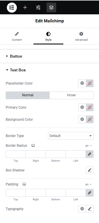
Text Box
-
- Placeholder Color – Here you can change or remove the placeholder color.
- Primary Color – Here you can change or remove the primary Color and hover color.
- Background Color – Here you can change or remove the Background Color and hover color.
- Border Type – This is an option for selecting the type of the border.
- Border Radius – This is an option to set a value for the text Box border radius.
- Box Shadow – Here you can Enable/Disable Text box shadow .
- Padding – Here you can set padding value for Text box.
- Typography – Here you can customize the style, size, and arrangement of the text.
Icon
Here you can set Style for Mailchimp Icon Normal View and Hover View. -