
This shortcode For to Add the Slider Widget.

Content
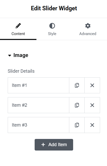
Slider Details
- Select Type – Here you add as many sliders as you want by the use of repeater.
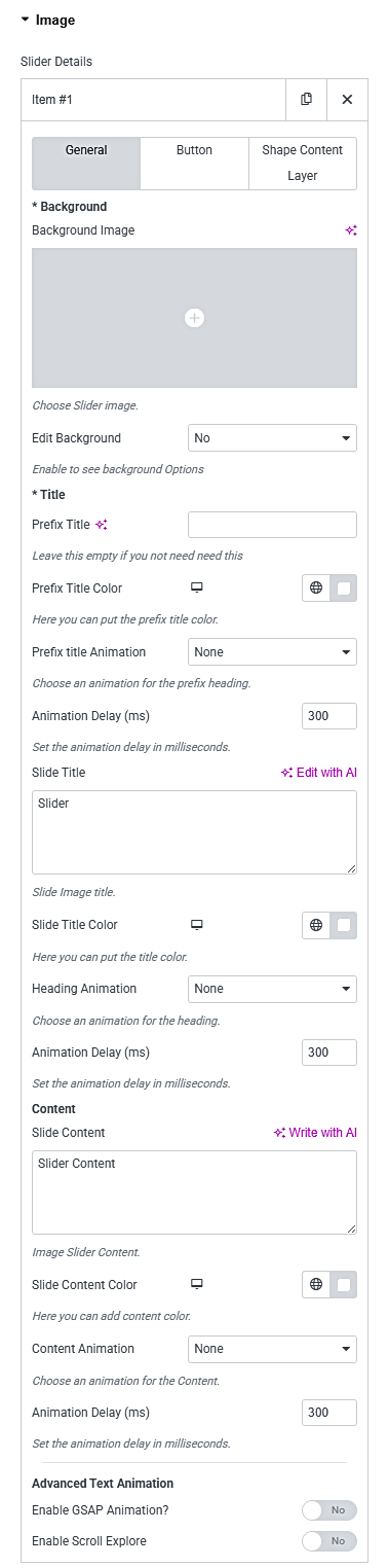
General
- Background Image – Here you can upload the Slider Background Image.
- Edit Background – Here select ‘yes’ if you want to edit the Background.
- Prefix Title – Here you can enter the Preffix Title.
- Prefix Title Color – Here you can choose the color of the Prefix Title.
- Prefix Title Animation – Here you can choose the gsap animation or common animation for the Prefix Title.
- Animation Delay – Here you can enter the animation delay for the Prefix Title.
- Slide Title – Here you can enter the Main Slider Title.
- Slide Title Color – Here you can choose the color of the Slide Title.
- Heading Animation – Here you can choose the gsap animation or common animation for the Heading.
- Animation Delay – Here you can enter the animation delay for the Slide Title.
- Slide Content – Here you can enter the content of the Slider.
- Slide Content Color – Here you can choose the color of the Slide Content.
- Content Animation – Here you can choose the gsap animation or common animation for the Content.
- Animation Delay – Here you can enter the animation delay for the Slide Content.
- Scroll to Explore Button – Add a scroll-down button to guide users to explore more content below the slider.
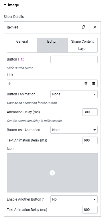
Button
- Button Name – Here you can enter the text that will display on the Button.
- Link – Here you can enter the link that redirect when it clicked.
- Button Animation – Here you can choose the animation for the Button.
- Animation Delay – Here you can enter the animation delay for the Slide Button.
- Icon – Here you can select the icon for the Button.
- Enable Another Button – Here you can select yes to enable another Button.
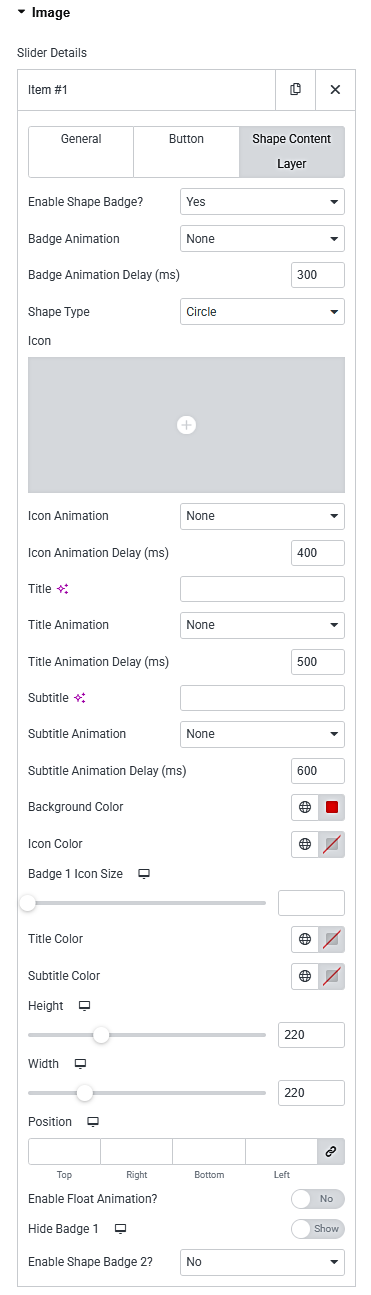
Shape content Layer
- Icon – Here you can select the icon for the Layer.
- Title – Here you can enter the Title.
- Title Entry Animations- Here you can choose the animations for Title.
- Subtitle – Here you can enter the Subtitle.
- Subtitle Entry Animations- Here you can choose the animations for Subtitle.
- Custom shape – Here you can choose the shape (Rounded box or Circle) for Layer.
- Float Animations- Here you can choose the float animation for Layer.
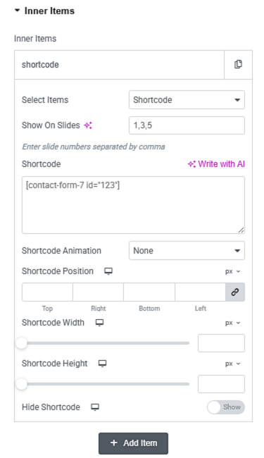
Inner Items
- Select Type – Here you add as many inner items as you want by the use of repeater.
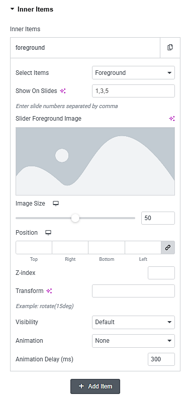
Foreground Image
- Slider Foreground Image – Here you can choose the Slider Foreground Image.
- Show On Slides – Here you can enter slide numbers for where a Foreground appears .
- Image Size – Here you can set the Image Size.
- Image Position – Here you can choose the position of the Foreground Image.
- Z-index – Here you can choose the z-index of the Foreground Image.
- Transform – Here you can enter any tranform property for the image.
- Visiblity – Here you can select the visibility for the image
- Animation – Here you can select the Animation for the Image
- Animation Delay – Here you can enter the animation delay for the Image.
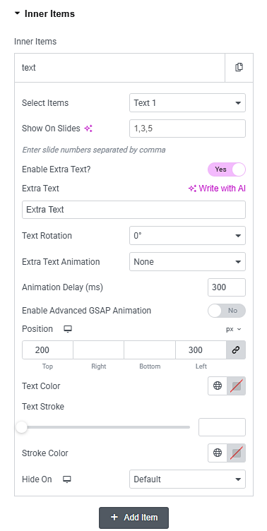
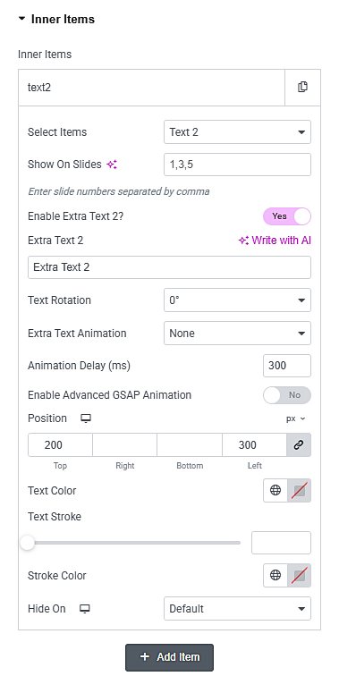
Text
- Text Name – Here you can enter the text that will display on the slides.
- Text Show On Slides – Here you can enter slide numbers for where a Text appears .
- Text Color- Here you can choose the color of the text.
- Text Rotation – Here you can set the rotation angle of the text in degrees.
- Text Animation – Here you can select the animation effect to apply to the text.
- Text Animation Delay – Here you can define the delay time before the text animation starts.
- Text Position – Here you can set the position of the Text using top, right, bottom, and left values for precise placement.
- Text Stroke – Here you can enable or set the thickness of the text stroke (outline).
- Text Stroke Color – Here you can choose the color of the text stroke (outline).
- Text Hide On – Here you can select devices (Desktop, Tablet, Mobile) where the text should be hidden.
Html
- Html Content – Here you can add custom HTML content using the editor. This allows you to insert text, images, buttons, or any custom markup inside the slider.
- Html Content Show On Slides – Here you can enter slide numbers for where a HTML appears .
- Html Content Animation- Here you can select the animation effect to apply to the HTML content.
- Html Content Position – Here you can Set the position of the HTML layer using top, right, bottom, and left values for precise placement.
- Html Content Width – Here you can define the width of the HTML content area using responsive units (px, %, vw).
- Html Content Height – Here you can Set the height of the HTML content area using px or viewport height (vh).
- Html Content Hide On – Here you can select devices (Desktop, Tablet, Mobile) where the HTML should be hidden.
Shortcode
- Shortcode – Here you can enter a valid shortcode (e.g., contact forms ) to display dynamic content inside the slider.
- Shortcode Show On Slides – Here you can enter slide numbers for where a Text appears .
- Shortcode Animation – Here you can select the animation effect to apply to the text.
- Shortcode Animation Delay – Here you can define the delay time before the text animation starts.
- Shortcode Position – Here you can Set the position of the HTML layer using top, right, bottom, and left values for precise placement.
- Shortcode Width – Here you can define the width of the shortcode content area using responsive units (px, %, vw).
- Shortcode Height – Here you can set the height of the shortcode container using px or viewport height (vh).
- Shortcode Hide On – Here you can select devices (Desktop, Tablet, Mobile) where the shortcode should be hidden.
Slider
- Slider Options – Here you can enable this for slider options.
- Slider Height – Here you can set the slider Height.
- Slider Items – Here you can set the no. of Items that should display.
- Items on Tab – Here you can set the no. of Items that should display on Tab.
- Items on Mobile – Here you can set the no. of Items that should display on Mobile.
- Auto Play – Here you can enable this for auto play.
- Loop – Here you can enable this for infinite loop.
- Item Center – Here you can enable this for slider center alignment.
- Navigation – Here you can enable this for slider navigation.
- Pagination – Here you can enable this for slider pagination.
- Bullet Style – Here you can choose the paginate bullet styles.
- Lazyload option – Here you can enable this for slider loaded on lazyload.
- Rewind – Here you can enable this for slider that goes backward when the boundary is reached.
- Mouse Drag – Here you can enable this for mouse drag.
- Items Margin – Here you can set the slider margin space.
- Items Duration – Here you can set the slider duration for autoplay.
- Items Smart Speed- Here you can set the slider smart speed.
- Items Slideby – Here you can set the slider scrollby.
- Pause on Hover – Here you can enable this option for pause on mouse hover.
- Custom Navigation – Here you can enable this option for Custom navigation(Icon 0r Text).
- Progressbar Pagination – Here you can enable this option for Progress bar pagination.
- Dynamic Bullets – Here you can enable this option for Dynamic bullet pagination.
- Keyboard Control – Here you can enable this option for Keyboard control slide.
- Click To Slide – Here you can enable this option for Click to slide.
- Mouse Wheel Control – Here you can enable this option for Slides slide from mouse wheel intraction.
- Kenburn Animation – Here you can enable this option for Image zoom animation.
- Webgl Animation – Here you can enable this option for Slides Entry and Exit animation.
Styles
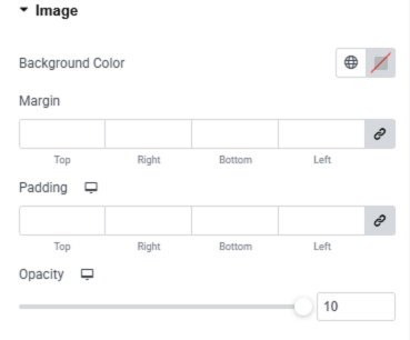
Image
- Background Color – Here you set the background color.
- Margin – Here you can set the margin for the image.
- Padding – Here you can set the padding for the image.
- Opacity – Here you can set the opacity for the image.
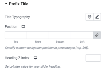
Prefix Title
- Title Typography – Here you can set typographical settings link font size, font family, line height, etc.
- Position – Here you can set the position of the Prefix Title.
- Heading Z-index – Here you can set the z-index for the title text.
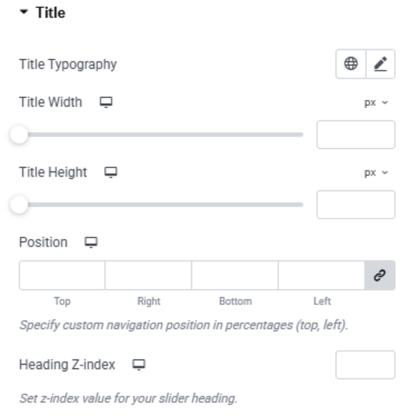
Title
- Title Typography – Here you can set typographical settings link font size, font family, line height, etc.
- Position – Here you can set the position of the Title
- Heading Z-index – Here you can set the z-index for the title text.
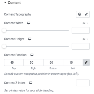
Content
- Content Typography – Here you can set typographical settings link font size, font family, line height, etc.
- Content Position – Here you can set the position of the Content Text.
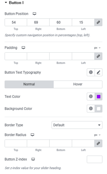
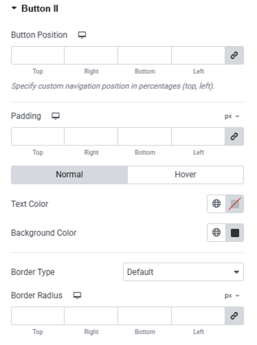
Button 1&2
- Button Position – Here you can set the position for the button.
- Padding – Here you can set the padding for the button.
- Button Text Typography – Here you can set typographical settings link font size, font family, line height, etc.
- Text Color – Here you can set the text color and hover text color for the button.
- Background Color – Here you can set the Background Color and Hover background color of the button.
- Border Type – Here you can select the background type.
- Border Radius – Here you set the border radius for the button.
- Button Z-index – Here you can set the z-index for the button.
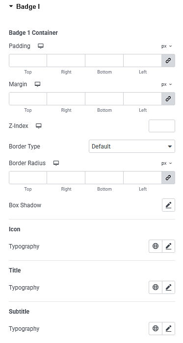
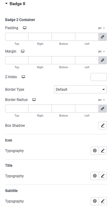
Badge 1&2
- Badge Padding – Here you can set the padding for the badge container.
- Badge Margin – Here you can set the margin for the badge container.
- Badge Icon Typography – Here you can set typographical settings link font size, font family, line height, etc.
- Badge Title Typography – Here you can set typographical settings link font size, font family, line height, etc.
- Badge Subtitle Typography – Here you can set typographical settings link font size, font family, line height, etc.
- Badge Border Type – Here you can select the background type.
- Badge Border Radius – Here you set the border radius for the badge.
- Badge Button Z-index – Here you can set the z-index for the badge.
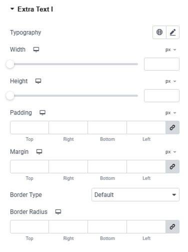
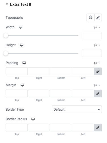
Extra Text 1&2
- Extra Text Padding – Here you can set the padding for the extra text.
- Extra Text Margin – Here you can set the margin for the extra text.
- Extra Text Width – Here you can define the width of the extra text area using responsive units (px, %, vw).
- Extra Text Height – Here you can set the height of the extra text using responsive units (px, %, vw).
- Extra Text Typography – Here you can set typographical settings link font size, font family, line height, etc.
- Extra Text Border Type – Here you can select the background type.
- Extra Text Border Radius – Here you set the border radius for the extra text.
- Extra Text Z-index – Here you can set the z-index for the extra text.
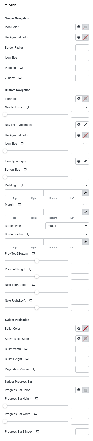
Slide
Swiper Navigation
- Nav Icon Color – Here you can set the Navigation Icon color.
- Nav Icon Size – Here you can set the Navigation Icon size.
- Nav Icon Background Color – Here you can set the Navigation Icon background color.
- Nav Padding – Here you can set the Navigation padding.
- Nav Border Radius – Here you set the border radius for the Navigation.
- Nav Z-index – Here you can set the z-index for Navigation.
Custom Navigation
- Custom Nav Text Color – Here you can set the Custom Navigation Text color.
- Custom Nav Text Size – Here you can set the Custom Navigation Text size.
- Custom Nav Icon Color – Here you can set the Custom Navigation Icon color.
- Custom Nav Icon Size – Here you can set the Custom Navigation Icon size.
- Custom Nav Background Color – Here you can set the Custom Navigation background color.
- Custom Nav Padding – Here you can set the Custom Navigation padding.
- Custom Nav Padding – Here you can set the margin for the Custom Navigation.
- Custom Nav Border Type – Here you can select the background type.
- Custom Nav Border Radius – Here you set the border radius for the Custom Navigation.
- Custom Nav Prev Position – Here you can set the position for the Custom Navigation.
- Custom Nav Next Position – Here you can set the position for the Custom Navigation.
Pagination
- Pagination Bullet Color – Here you can set the Pagination Bullet color.
- Pagination Active Bullet Color – Here you can set the Pagination Active Bullet color.
- Pagination Bullet Height – Here you can set the height for Pagination Bullet.
- Pagination Bullet Width –Here you can set the width for Pagination Bullet.
- Pagination Bullet Z-Index – Here you can set the z-index for Pagination Bullet.
Progress Bar
- Progress Bar Color – Here you can set the Progress Bar color.
- Progress Bar Height – Here you can set the height for Progress Bar.
- Progress Bar Width –Here you can set the width for Progress Bar.
- Progress Bar Z-Index – Here you can set the z-index for Progress Bar.