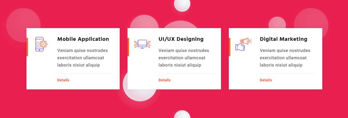
This Shortcode is used to display feature box , icon Box , Image Box and Video Box.
General
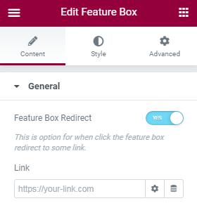
- Feature Box Redirect – This is option for feature box title as link. Enable yes to set title url.
Layout
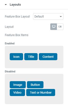
- Feature Box Layout – Here you can choose Feature Box Layout.
- Layout – Here you select Normal/List view of Feature Box.
- List view
- List Head Position – Choose Left/Right Position of Feature Box.
- Full Width Content – This option for Enable/Disable Feature Content Full Width
- Content Self Center – This option for Enable/Disable Feature Box List Style right side content set vertically middle
- Icon Self Center – This option for Enable/Disable Feature Box List Style Icon/Image set vertically middle
- Feature Box List Items – Here you can drag and drop the needed items to set Left and Right Part.
Title
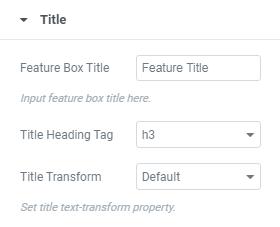
- Feature Box Title – Enter Feature Box Title here.
- Title Heading Tag – Here you can choose required title heading tag.
- Title Transform – Here you can set Title text-transform Property.
Icon
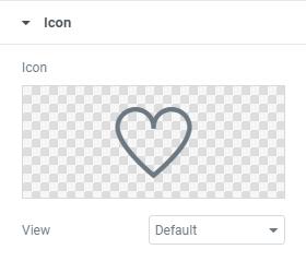
- Icon – Here you can select required Icon.
- View – Here you can set Icon View (Default/Stacked/Framed).
- Map Background Color – Here you can add Map’s Background Color.
Image
- Feature Box Image – Here you can add Feature Box Image.
- Image Size – Here you can select required image size.
Number
- Feature Box Number – Enter Feature Box Number here.
Button
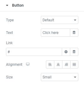
- Type – This is option for selecting type of the Button.
- Text – Enter Button Text Here.
- Link – Add button URL Link Here.
- Alignment – Here you can choose button alignment(Left/Right/Center)
- Size – Here you can choose button Size(Small/Medium/Large/Extra Small/Extra Large)
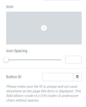
- Icon Spacing – This is option for giving space to Icon.
- Button ID – Here you can add Unique Button Id.
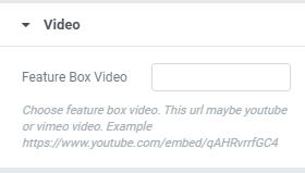
Video
- Feature Box Video – Enter Feature Box Video Link here. This URL may be Youtube & vimeo video
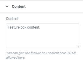
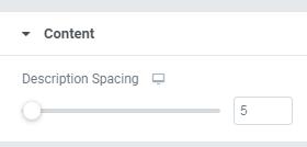
Content
- Content – Enter Feature Box Content here.
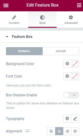
Style
Here you can set Feature Box Style for Normal View and Hover View.
- Background Color – Here you can add Feature Box Background Color.
- Font Color – Here you can add Feature Box Font Color.
- Box Shadow Enable – Here you can Enable/Disable box shadow.
- Typography – Here you can choose font family, size, weight etc..
- Alignment – Here you can choose Feature Box alignment(Left/Right/Center)
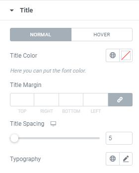
Title
Here you can set Feature Box Style for Normal View and Hover View.
- Title Color – Here you can add Feature Box Title Color.
- Title Margin – Here you can set margin for Feature Box Title.
- Title Spacing – This is option for giving space to Feature Box Title.
- Typography – Here you can choose Title font family, size, weight etc..
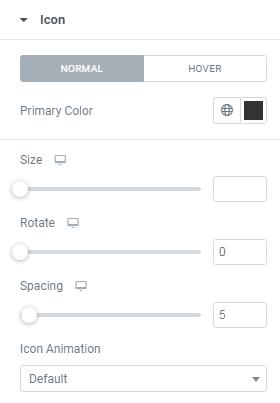
Icon
Here you can set Feature Box Icon Style for Normal View and Hover View.
- Primary Color – Here you can add Feature Box Icon Primary Color.
- Size – Here you can set Icon Size.
- Rotate – This is option for set Icon Rotate value.
- Spacing – This is option for giving space to Feature Box Icon.
- Icon Animation – This is option for choosing Feature Box Icon Animation style.
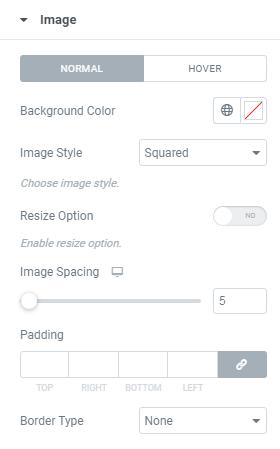
Image
Here you can set Style for Feature Box Image Normal View and Hover View.
- Background Color – Here you can add Background Color for image.
- Image Style – Here you can select Image Style(Squared,Rounded,Circled)
- Resize Option – Here you can Enable/Disable Image Resize Option
- Image Spacing – This is option for giving space to Image.
- Padding – Here you can set Padding value for image.
- Border Type – This is option for selecting type of the border.
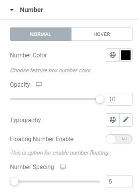
Number
Here you can set Style for Feature Box Number Normal View and Hover View.
- Number Color – Here you can add Feature Box Number Color.
- Opacity – Here you can set Number opacity.
- Typography – Here you can choose Number’s font family, size, weight etc..
- Floating Number – Here you can Enable/Disable Number Floating.
- Number Spacing – This is option for giving space to Feature Box Number.
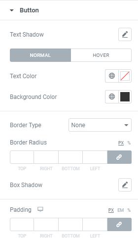
Button
Here you can set style for Button’s Normal View and Hover View.
- Text Shadow – Here you can set text shadow effect to the Button
- Text Color – Here you can add text Color.
- Background Color – Here you can add Button Background Color.
- Border Type – This is option for selecting type of the border.
- Border Radius – This is option to set value for the button border radius
- Box Shadow – Here you can Enable/Disable Button box shadow .
- Padding – Here you can set padding value for Button.
Content
- Description Spacing – This is option for giving space to Content.
Advanced
This settings will apply for the whole section.
Layout
- Margin – Here you set margin value for the section.
- Padding – Here you can set padding value for the section.
- Width – Select section’s width here.
- Position – Here you can section’s position.
- Z-index – Here you can set Z-index value for the section
- Css ID
– Enter the Section’s Id here. - Css Classes – Here you add extra css classes.
Motion Effects
- Here you can set Animation for the section.
Transform
- The transform CSS property lets you rotate, scale, skew, or translate an element. It modifies the coordinate space of the CSS visual formatting model.
Background
- Here you can set Background color, background image for the section.
Border
- Add Border, Border radius, Box shadow for the section here.
Mask
-
- This option allows you to set mask for the the section. here you can set mask shape, size and position.
Responsive
-
- Here you Hide the specific section on Desktop / Tablet / Mobile.