
This shortcode For to Add the Button.
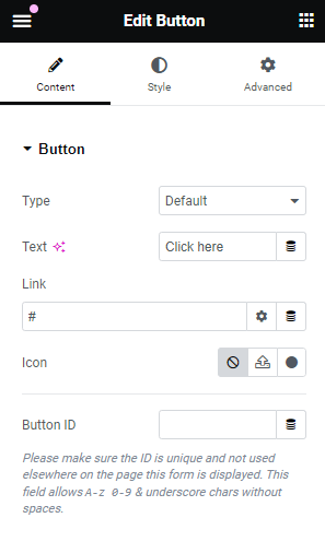
Button
- Type – Here you can select the category or kind of element (e.g., button, text).
- Text – Here you can enter the written content to be displayed.
- Link – Here you can enter a clickable reference to another page or resource.
- Alignment – Here you can set the positioning of elements relative to each other or the container.
- Size – Here you can adjust the dimensions or scale of the element.
- Icon- Here you can add a small graphic symbol representing an action or concept.
- Icon Spacing – Here you can set the distance between icons or between an icon and other elements.
- Button ID – Here you can assign a unique identifier to the button for reference or styling.
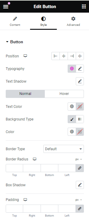
Style
- Text Shadow – Here you can add a shadow effect to the text for added depth.
- Text Color – Here you can choose the color of the text.
- Text Background – Here you can set the background color or image behind the text.
- Border Color – Here you can select the color of the border around the element.
- Border Radius – Here you can adjust the curvature of the corners of the border.
- Box Shadow – Here you can apply a shadow effect to the element’s box for a 3D look.
- Padding – Here you can set the space between the element’s content and its border.
- Typography – Here you can customize the style, size, and arrangement of the text.