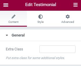
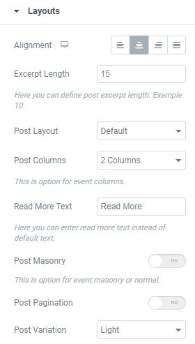
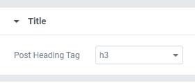
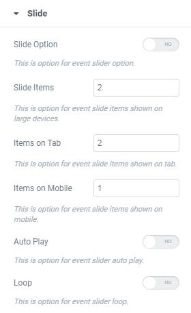
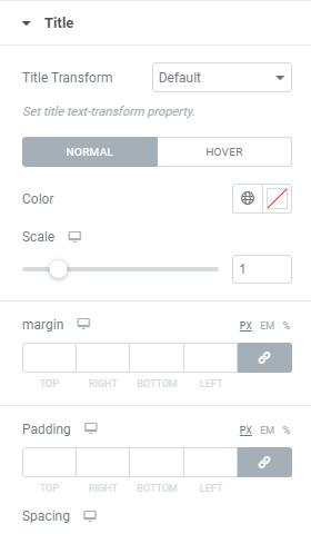
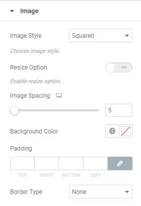
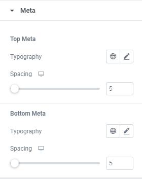
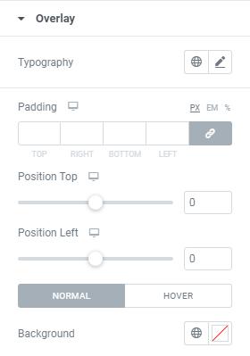
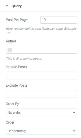
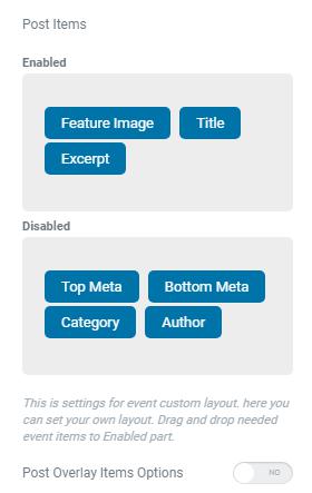
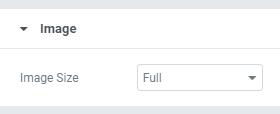
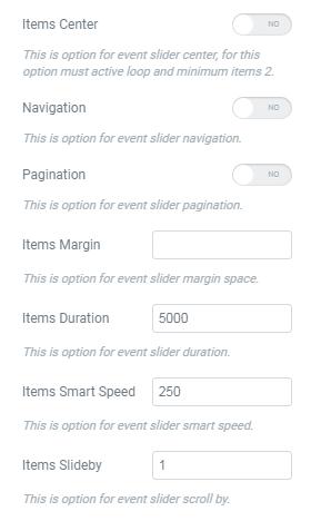
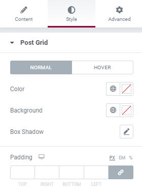
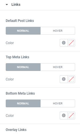
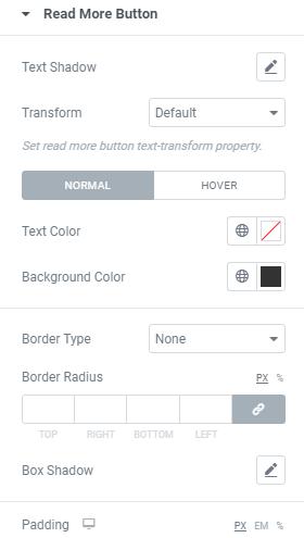
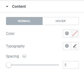
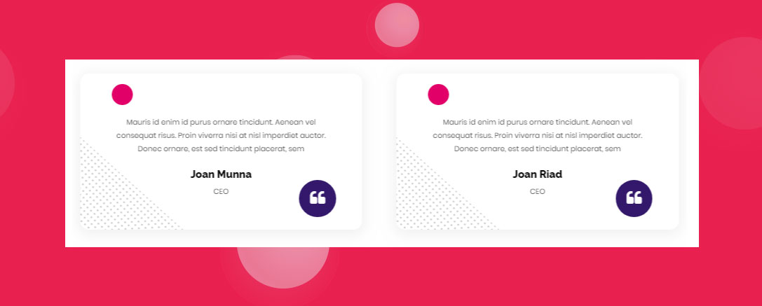
March 26, 2021 This shortcode displays Testimonials. General Extra Class – Here Enter the Class Name of Additional Style Title Heading Tag – Here you can choose heading size. Title Transform – Here you can set title text-transform Property. Query Post Per Page – Here you can define post limits per page. Example 10 Author – This is filter author posts. Include Post – This option for display selective posts by entering their Category Names. Exclude Post – This option for disable selective posts by entering their Category Names. Order By – This option for display the posts by any of these following Order Date, Id, Author, etc. Layout Alignment – This is option for Title alignment. Excerpt Length – Here you can define post excerpt length. Example 10 Post Layout – Here you can select Testimonial style and design Post Columns – This is option for select Testimonial columns. Read More Text – Here you can enter read more text instead of default text. Post Masonry – This is option for Enable/Disable Testimonial Masonry Layout. Post Pagination – This is option for content-carousel slider pagination Post Variation – This is option for choosing Light/Dark Variations Post Items – Here you can Enable/Disable items as per your requirments. Title Post Heading Tag – Here you can Choose required Heading tag. Image Image Size – Here you can Choose Size of the Image. Slide Slide Option – This is option for content-carousel slider option. Slide Items – This is option for content-carousel slide items shown on large devices. Items on Tab – This is option for content-carousel slide items shown on tab. Items on Mobile – This is option for content-carousel slide items shown on mobile. Auto Play – This is option for content-carousel slider auto play. Loop – This is option for content-carousel slider loop. Items Center – This is option for content-carousel slider center, for this option must active loop and minimum items 2. Navigation – This is option for content-carousel slider navigation. Pagination – This is option for content-carousel slider pagination. Items Margin – This is option for content-carousel slider margin space. Items Duration – This is option for content-carousel slider duration. Items Smart Speed – This is option for content-carousel slider smart speed. Items Slide by – This is option for content-carousel slider scroll by. Links Image, Title, Button – Here you can Enable/Disable Link target & Link Follow for Testimonial Image, Title & Button. Post Grid Here you can set Testimonial Style for Normal View and Hover View. Color – Here you can add Testimonial Color. Background – Here you can add Background Color. Box Shadow – Here you can Enable/Disable box shadow. Padding – Here you can set padding value for Testimonial. Title Here you can set Title Style for Normal View and Hover View. Title Transform – Here you can set Title text-transform Property. Color – Here you can add Title Color. Scale – This is option for giving space to Title. Margin – Here you can set margin for Testimonial Title. Padding – Here you can set Padding value for Testimonial Title. Spacing – This is option for giving space to Testimonial Title. Typography – Here you can choose Title font family, size, weight etc.. Links Post Links, Top Meta Links, Bottom Meta Links, Overlay Links – Here you can set color for Normal View and Hover View of all Links. Image Image Style – Here you can select Image Style(Squared,Rounded,Circled) Resize Option – Here you can Enable/Disable Image Resize Option Image Spacing – This is option for giving space to Image. Background Color – Here you can add Background Color for image. Padding – Here you can set Padding value for image. Border Type – This is option for selecting type of the border. Read More Button Here you can set style for Button’s Normal View and Hover View. Text Shadow – Here you can set text shadow effect to the Button Transform – Here set Button text-transform Property. Text Color – Here you can add text Color. Background Color – Here you can add Button Background Color. Border Type – This is option for selecting type of the border. Border Radius – This is option to set value for the button border radius Box Shadow – Here you can Enable/Disable Button box shadow . Padding – Here you can set padding value for Button. Meta Top Meta & Bottom Meta – Here you can choose Top Meta & Bottom Meta Typograpy style & Space. Content Here you can set style for Content Normal View and Hover View. Color – Here you can add Content Color. Typography – Here you can set Typo Styles. Spacing – This is option for giving space to Content. Overlay Here you can set Overlay Style for Normal View and Hover View. Typography – Here you can set Overlay Typo Styles. Padding – This is option for giving Padding value to Icon. Position Top – Here you can adjust Overlay Position from Top to Bottom. Position Left – Here you can adjust Overlay Position from Left to Right. Background Color – Here you can add Overlay Background Color. ← Team Toggle Content → Leave a Reply Cancel replyYour email address will not be published. Required fields are marked *Comment * Name * Email * Website Save my name, email, and website in this browser for the next time I comment.