We have a great Support Team. No matter what issue you are facing our Support Team will help you resolve your issues.
Instant Support:
For instant support please send you chat ID ( Skype or Gtalk ) and Whatsapp.
We do not provide support for additional customization, 3rd party plug-ins integration or any other compatibility issues that might arise. Nevertheless, there is an exception that is only applied to the plug-in(s) we have developed and integrated ourselves.
Support Hours:
If you have any questions that are beyond the scope of this help file, feel free to post them on our support message board (forum) at https://zozothemes.ticksy.com/. We will respond as soon as possible (within 24 – 48 hours, usually faster). We are open from 9am to 7pm (GMT), from Monday till Friday. Please be aware that a lot of the questions that are posted in the forum have been posted many times before, and get the same answers each time.
Before submitting a new ticket, please try searching the forum for an answer, as well as checking our Articles. The forum has its own inner search and also has been indexed by Google, so if you can not find your answer with a forum search, it is worth typing it into Google too. Please make sure you have looked at all the available resources before submitting a support request.
WordPress Information
If you are new to WordPress, there is a step-by-step plan for getting started. Plenty of options for assistance are listed in this article. If you need help installing WordPress, below are all the useful links for WordPress information.
How to install Zozo Header Footer Plugin?
IMPORTANT! Before you begin, make sure that you have installed & activated Elementor Plugin on your website.
Follow these steps below to install Zozo Header Footer Plugin:
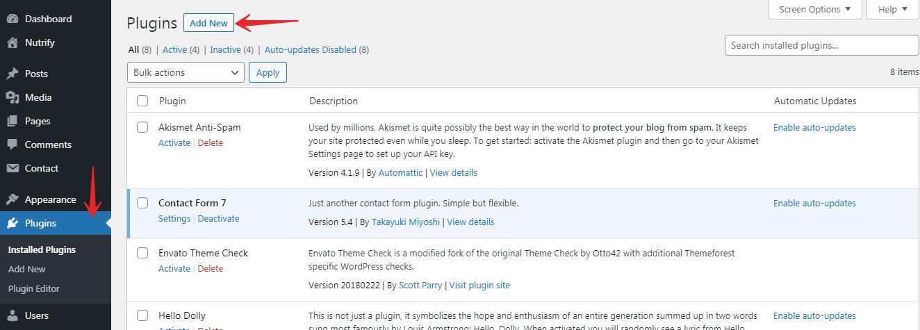
Step 1: Go to your WordPress Dashboard and navigate to Wp-admin > Plugins > Add New > Upload Plugin > Choose File. Then simply click on the ‘Install Now’ button.
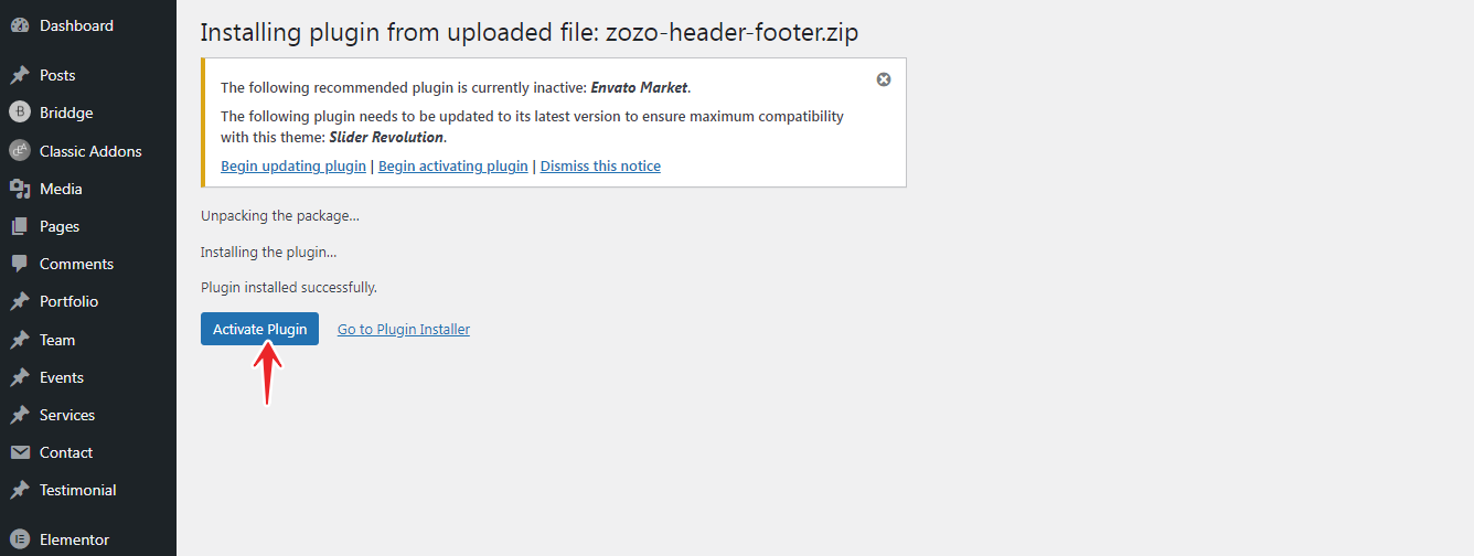
Step 2: After the installation is completed, click on the ‘Activate’ button and Zozo Header Footer will be activated.
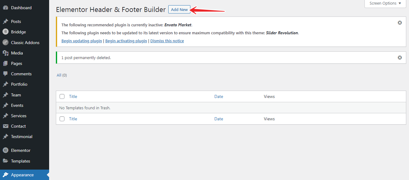
Step 3: After you have successfully completed Step 2, You will find Elementor Header & Footer Builder will appear in the Appearance Menu.
Here you can create Multiple Custom Header & Footer Templates or any Custom Blocks.
Appearance > Elementor Header & Footer Builder >> Add New Create Header/Footer/Custom Block Templates.
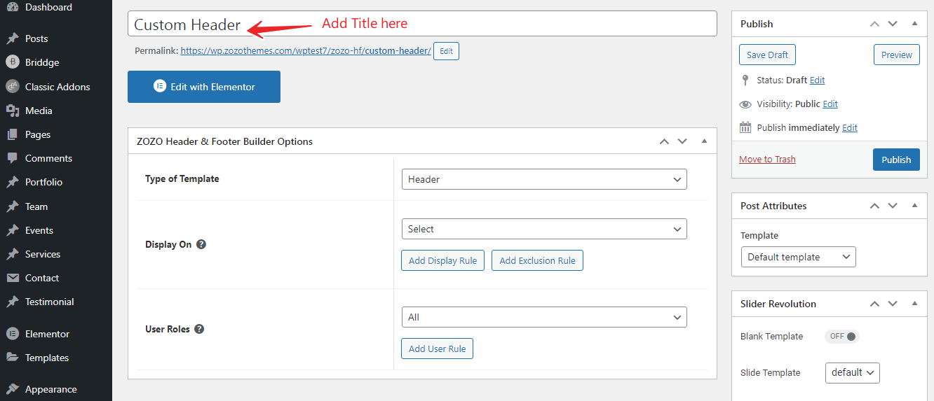
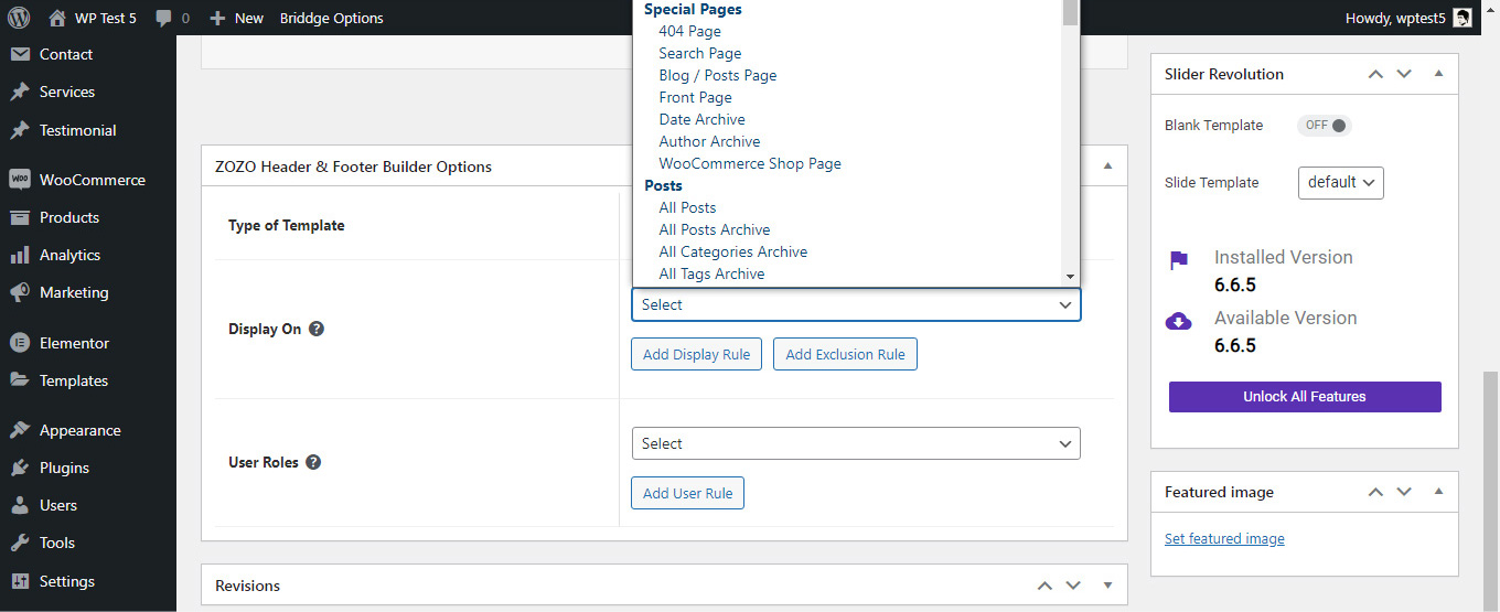
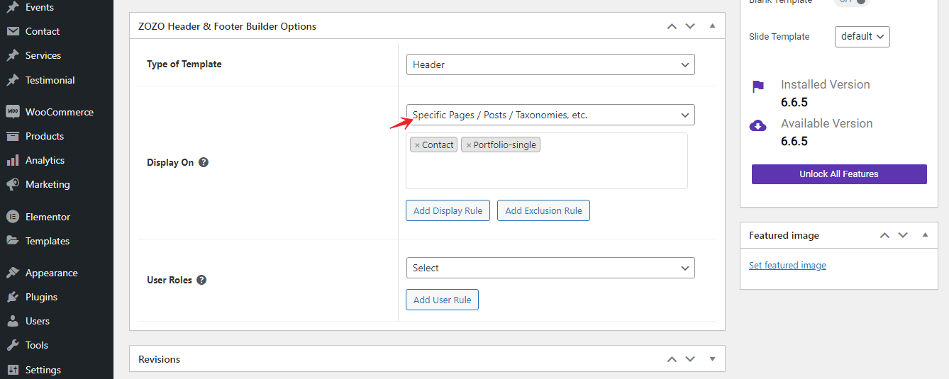
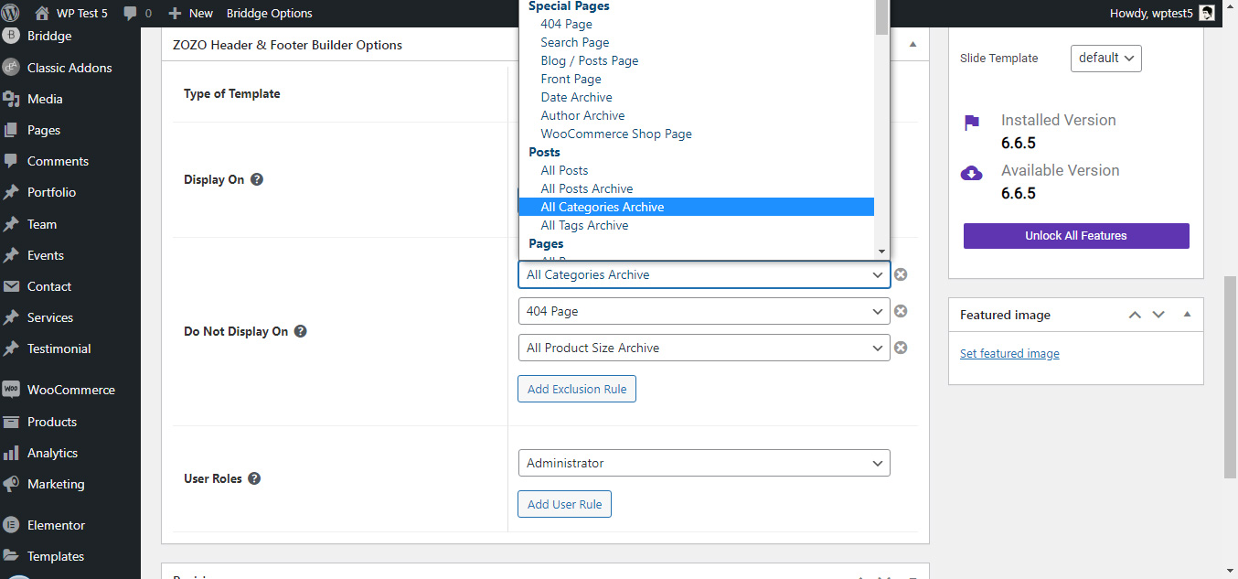
Zozo Header & Footer Builder Options
Type of Template: Here you can select the type of the template like Header/Footer/Custom Block.
Display On: Choose the location where you want to display the template. You can select Multiple locations by clicking "Add Display Rule"
Also you can display this template any particular page/post/Taxonomie etc., by choosing Specific pages/posts/Taxonomies,etc
Do Not Display On: You can exclude the locations where you don't want to display the template by clicking "Add Exclusion Rule"
User Roles: Here you can choose the template based on the user role
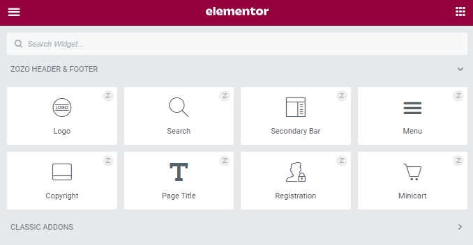
These Shortcodes help you to build the professional & creative Header/Footer/Custom Block Templates.

Logo
Content
Site Logo
- Custom Logo - This is option for custom logo. Enable this to use desired logo, or else leave disable state to set default one.
- Logo Image - Upload logo image here.
- Image Size - Here you can choose logo's size.
- Alignment - Assign Logo to Left/Center/Right.
- Custom Link - Add Logo's link here.
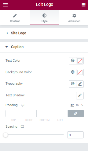
Caption
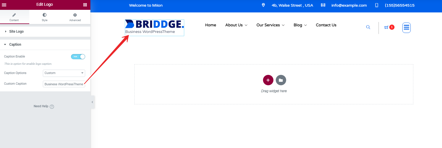
- Caption Enable - This is option for enable logo's caption.
- Caption Options - Here you can choose default or custom caption for the logo.
Style
Site Logo
- Width - Choose the Width of the Logo.
- Max Width - Here you can choose the Max Width of the Logo.
- Background Color - Select the Background Color for the Logo.
- Border Style - Here you can choose logo's border style.
- Border Radius - Set the radius style for the logo's border here.
- Box Shadow - This option is for set box shadow style for the logo.
- Opacity - Set the Opacity style for logo
- Css Filters - Here you change the logo's look.
Caption
- Text Color - Here you can add Logo Caption's Text Color.
- Background Color - Select the Background Color for the Caption.
- Typography - Here you can choose Caption's font family, size, weight etc..
- Text Shadow - This option is for set box shadow style for the Caption.
- Padding - Here you can set padding value of caption.
- Spacing - This option for adjust the space between logo image and caption.
Advanced
This settings will apply for the whole section.
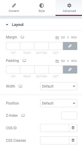
Layout
- Margin - Here you set margin value for the section.
- Padding - Here you can set padding value for the section.
- Width - Select section's width here.
- Position - Here you can set section's position.
- Z-index - Here you can set Z-index value for the section
- Css ID - Enter the Section's unique Id here.
- Css Classes - Here you add extra css classes.
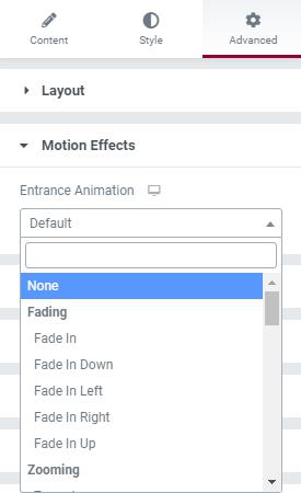
Motion Effects
- Here you can set Animation for the section.
Transform
- The transform CSS property lets you rotate, scale, skew, or translate an element. It modifies the coordinate space of the CSS visual formatting model.
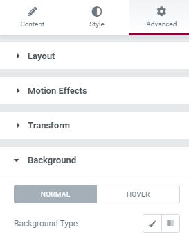
Background
- Here you can set Background color, background image for the section.
Border
- Add Border, Border radius, Box shadow for the section here.
Mask
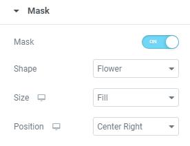
- This option allows you to set mask for the the section. here you can set mask shape, size and position.
Responsive
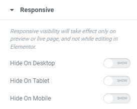
- Here you Hide the specific section on Desktop / Tablet / Mobile.
Logo Examples
Search
Content
Search
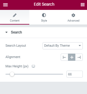
- Search Layout - Choose any of the Search Layout style here.
- Alignment - Assign Search Option to the Left/Center/Right.
- Max Height - Set the Max height value of the Search box here.
Style
Icon
Here you can set style for Icon’s Normal View and Hover View.
- Primary Color - Select the Primary Color of the Icon here.
- Background Color - Select the Background Color for the Icon.
- Border Color - Select the Border Color of the Icon.
- Size - This is option for set the size of the Icon.
- Padding - Here you can set padding value of the Icon.
- Rotate - This option is for rotate the icon.
- Spacing - This option set space for the icon.
- Border Width - Here you can Icon's border width.
- Border Radius - Set the radius style for the Icon's border here.
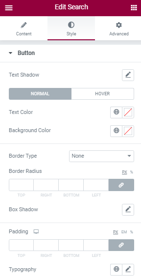
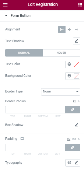
Button
Here you can set style for Button’s Normal View and Hover View.
- Text Shadow - Here you can set text shadow effect to the Button.
- Text Color - Here you can add text Color.
- Background Color - Here you can add Button's Background Color.
- Border Type - This is option for selecting type of the border.
- Border Radius - Set the radius style for the button's border here.
- Box Shadow - This option is for set box shadow style for the button.
- Padding - Here you can set padding value of the button.
- Typography - Here you can choose button's font family, size, weight etc..
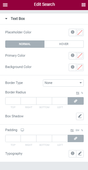
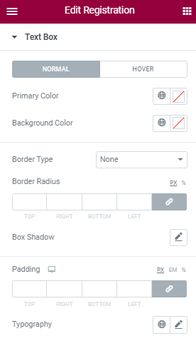
Text Box
- Placeholder Color - Here you can add Search Placeholder Color.
- Primary Color - Select the Primary Color of the Placeholder here.
- Background Color - Select the Background Color for the Placeholder.
- Border Type - This is option for selecting type of the border.
- Border Radius - Set the radius style for the Text Box's border here.
- Box Shadow - This option is for set box shadow style for the Text Box.
- Padding - Here you can set padding value of the Text Box.
- Typography - Here you can choose Text Box's font family, size, weight etc..
Advanced
This settings will apply for the whole section.
Layout
- Margin - Here you set margin value for the section.
- Padding - Here you can set padding value for the section.
- Width - Select section's width here.
- Position - Here you can set section's position.
- Z-index - Here you can set Z-index value for the section
- Css ID - Enter the Section's unique Id here.
- Css Classes - Here you add extra css classes.
Motion Effects
- Here you can set Animation for the section.
Transform
- The transform CSS property lets you rotate, scale, skew, or translate an element. It modifies the coordinate space of the CSS visual formatting model.
Background
- Here you can set Background color, background image for the section.
Border
- Add Border, Border radius, Box shadow for the section here.
Mask
- This option allows you to set mask for the the section. here you can set mask shape, size and position.
Responsive
- Here you Hide the specific section on Desktop / Tablet / Mobile.
Search Examples
Secondary Bar
Content
Trigger
- Default Icon - Select the Secondary bar icon here.
- Alignment - Assign Secondary bar icon to the Left/Center/Right.
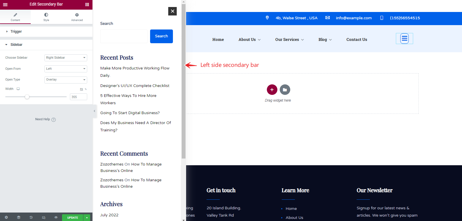
Sidebar
- Choose Sidebar - Select the sidebar that you want to display on the secondary bar.
- Open From - Choose the position that Secondary bar display from (Left/Right).
- Open Type - Select the Secondary bar's open type (Overlay/Push).
- Width - Set the Width of the Secondary bar here.
Style
Icon
Here you can set style for Icon’s Normal View and Hover View.
- Primary Color - Select the Primary Color of the Icon here.
- Background Color - Select the Background Color for the Icon.
- Border Color - Select the Border Color of the Icon.
- Size - This is option for set the size of the Icon.
- Padding - Here you can set padding value of the Icon.
- Rotate - This option is for rotate the icon.
- Spacing - This option set space for the icon.
- Border Width - Here you can Icon's border width.
- Border Radius - Set the radius style for the Icon's border here.
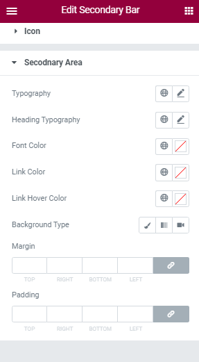
Secondary Area
- Typography - Here you can choose the Secondary Area's font family, size, weight etc..
- Heading Typography - Here you can choose the Secondary Area Heading's font family, size, weight etc..
- Font Color - Here you can add Secondary Area's Text Color.
- Link Color - Select the Link Color for the Secondary Area.
- Link Hover Color - Select the Link Hover Color for the Secondary Area.
- Background Type - Here you can choose background type of the Secondary Area.
- Color - Choose Secondary Area's color here.
- Image - Upload the Secondary Area's Image here.
- Margin - Here you can Set Margin value.
- Padding - This option for set padding value of the Secondary Area.
Advanced
This settings will apply for the whole section.
Layout
- Margin - Here you set margin value for the section.
- Padding - Here you can set padding value for the section.
- Width - Select section's width here.
- Position - Here you can set section's position.
- Z-index - Here you can set Z-index value for the section
- Css ID - Enter the Section's unique Id here.
- Css Classes - Here you add extra css classes.
Motion Effects
- Here you can set Animation for the section.
Transform
- The transform CSS property lets you rotate, scale, skew, or translate an element. It modifies the coordinate space of the CSS visual formatting model.
Background
- Here you can set Background color, background image for the section.
Border
- Add Border, Border radius, Box shadow for the section here.
Mask
- This option allows you to set mask for the the section. here you can set mask shape, size and position.
Responsive
- Here you Hide the specific section on Desktop / Tablet / Mobile.
Seconday bar Examples
Sticky Header
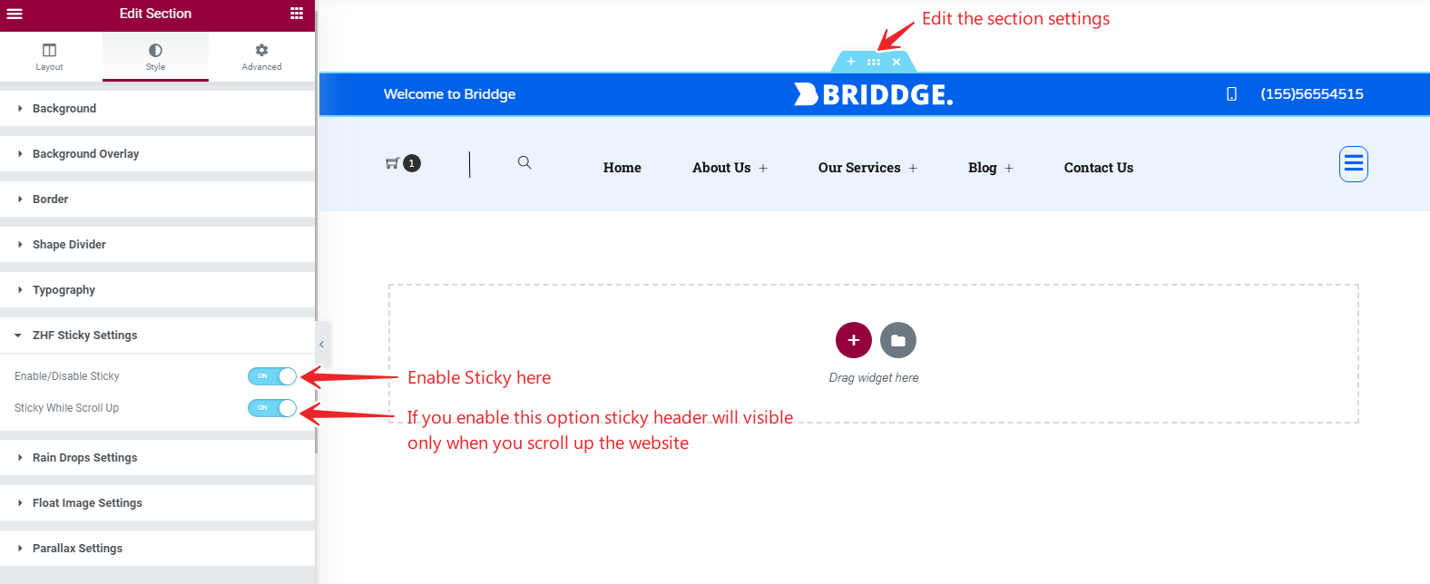
- If you want to make your Header Sticky, Edit Section >> Style >> ZHF Sticky Settings Here you can enable it.
Attention! If you want to make your entire header sticky (Topbar/Logobar/Navbar), Put all those in a single section by using inner rows.
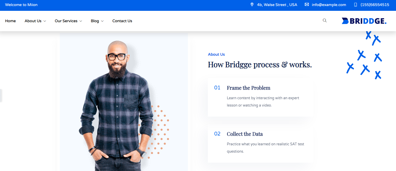
Sticky Header Examples
Copyright
Content
Copyright
- Copyright Text - Enter your Copyright Text here.
- Link - Here you can enter the Link of the Copyright Tex.
- Alignment - Assign Copyright Text to the Left/Center/Right.
Style
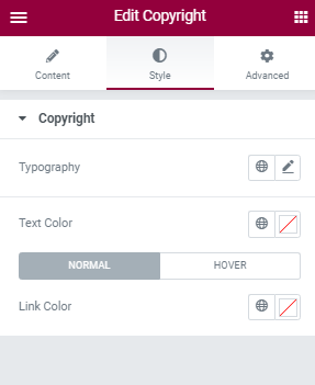
Copyright
- Typography - Here you can choose the Copyright's font family, size, weight etc..
- Text Color - Here you can add Copyright's Text Color.
- Link Color - Select the Link Color for the Copyright Text.
Advanced
This settings will apply for the whole section.
Layout
- Margin - Here you set margin value for the section.
- Padding - Here you can set padding value for the section.
- Width - Select section's width here.
- Position - Here you can set section's position.
- Z-index - Here you can set Z-index value for the section
- Css ID - Enter the Section's unique Id here.
- Css Classes - Here you add extra css classes.
Motion Effects
- Here you can set Animation for the section.
Transform
- The transform CSS property lets you rotate, scale, skew, or translate an element. It modifies the coordinate space of the CSS visual formatting model.
Background
- Here you can set Background color, background image for the section.
Border
- Add Border, Border radius, Box shadow for the section here.
Mask
- This option allows you to set mask for the the section. here you can set mask shape, size and position.
Responsive
- Here you Hide the specific section on Desktop / Tablet / Mobile.
Copyright Examples
Page Title
Content
Page Title
- Prefix Title - Enter the Archive Page's Prefix title here.
- Suffix Title - Enter the Archive Page's Suffix title here.
- Heading Tag - Here you can choose the section title box title heading tag.
- Alignment - Assign Title to Left/Center/Right.
- Breadcrumb - Enable/Disable Breadcrumb here.
- Display Style - Here you can select where to display breadcrumb.
Breadcrumb
- Display Position - Choose the breadcrumbs position here Top/bottom.
- Alignment - Assign breadcrumb to Left/Center/Right.
- Separator Icon - Here you can choose the breadcrumbs's Separator Icon.
Style
General
- Padding - Here you can set padding value of the Page Title.
- Margin - Set margin value for the Page Title here.
- Background Type - Select the Background Type of the Page title [Image/Color/Video].
- Background Overlay Type - Select the Background Overlay Type of the Page title here [Image/Color/Video].
Page Title
- Page Title Color - Here you can choose the color of the Page Title.
- Typography - Here you can choose Page Title's font family, size, weight etc..
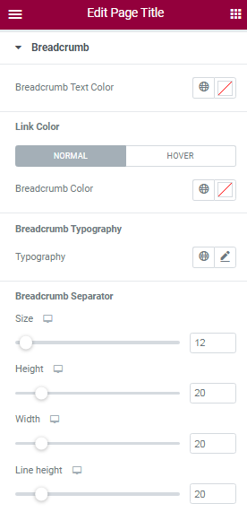
Breadcrumb
Breadcrumb Separator
- Size - Choose the Breadcrumb Separator Icon's size here.
- Height - Here you can choose Breadcrumb Separator Icon's height.
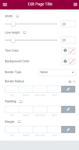
- Width - Set the width of the Breadcrumb Separator here.
- Line Height - Here you can choose Breadcrumb Separator Icon's Line height.
- Text Color - Select the Breadcrumb Separator Icon's color here.
- Background Color - Select the Background Color for the Breadcrumb Separator Icon.
- Border Type - Choose the Breadcrumb Separator Icon's border type here.
- Width - This option is for set width of the separator icons's border.
- Color - Here you can choose the separator icons's border color.
- Border Radius - Here you can set border radius value for the breadcrumb
- Padding - Here you can set padding value of the Breadcrumb Separator.
- Margin - Here you can set Margin value of the Breadcrumb Separator.
Advanced
This settings will apply for the whole section.
Layout
- Margin - Here you set margin value for the section.
- Padding - Here you can set padding value for the section.
- Width - Select section's width here.
- Position - Here you can set section's position.
- Z-index - Here you can set Z-index value for the section
- Css ID - Enter the Section's unique Id here.
- Css Classes - Here you add extra css classes.
Motion Effects
- Here you can set Animation for the section.
Transform
- The transform CSS property lets you rotate, scale, skew, or translate an element. It modifies the coordinate space of the CSS visual formatting model.
Background
- Here you can set Background color, background image for the section.
Border
- Add Border, Border radius, Box shadow for the section here.
Mask
- This option allows you to set mask for the the section. here you can set mask shape, size and position.
Responsive
- Here you Hide the specific section on Desktop / Tablet / Mobile.
Page Title Examples
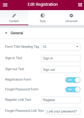
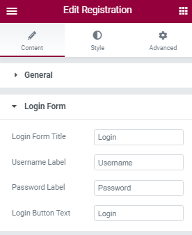
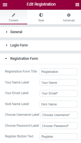
Registration
Advanced
This settings will apply for the whole section.
Layout
- Margin - Here you set margin value for the section.
- Padding - Here you can set padding value for the section.
- Width - Select section's width here.
- Position - Here you can set section's position.
- Z-index - Here you can set Z-index value for the section
- Css ID - Enter the Section's unique Id here.
- Css Classes - Here you add extra css classes.
Motion Effects
- Here you can set Animation for the section.
Transform
- The transform CSS property lets you rotate, scale, skew, or translate an element. It modifies the coordinate space of the CSS visual formatting model.
Background
- Here you can set Background color, background image for the section.
Border
- Add Border, Border radius, Box shadow for the section here.
Mask
- This option allows you to set mask for the the section. here you can set mask shape, size and position.
Responsive
- Here you Hide the specific section on Desktop / Tablet / Mobile.
Minicart
Content
General
- Cart Layout - This option is for selecting Cart Layout.
- Alignment - Assign Copyright Cart Layout to the Left/Center/Right.
- Max Height - Here you can set the height of the cart.
Style
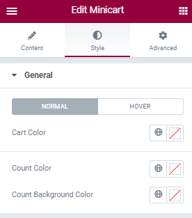
General
Here you can set style for Cart’s Normal View and Hover View.
- Cart Color - Here you can choose the Color of the Cart.
- Count Color - Add the Count color of the cart here.
- Count Background Color - Set Background color for the count here.
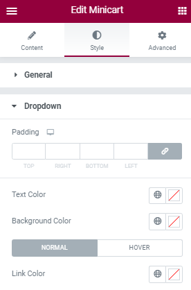
Dropdown
- Padding - Here you can set padding value for cart's dropdown.
- Text Color - This option for selecting dropdown's text color.
- Background Color - Set Background color for the dropdown here.
- Link Color - Add the dropdown's link color here.
Advanced
This settings will apply for the whole section.
Layout
- Margin - Here you set margin value for the section.
- Padding - Here you can set padding value for the section.
- Width - Select section's width here.
- Position - Here you can set section's position.
- Z-index - Here you can set Z-index value for the section
- Css ID - Enter the Section's unique Id here.
- Css Classes - Here you add extra css classes.
Motion Effects
- Here you can set Animation for the section.
Transform
- The transform CSS property lets you rotate, scale, skew, or translate an element. It modifies the coordinate space of the CSS visual formatting model.
Background
- Here you can set Background color, background image for the section.
Border
- Add Border, Border radius, Box shadow for the section here.
Mask
- This option allows you to set mask for the the section. here you can set mask shape, size and position.
Responsive
- Here you Hide the specific section on Desktop / Tablet / Mobile.
Divider
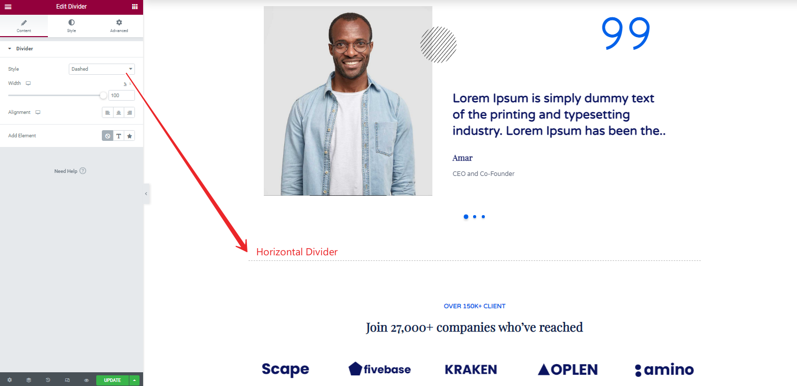
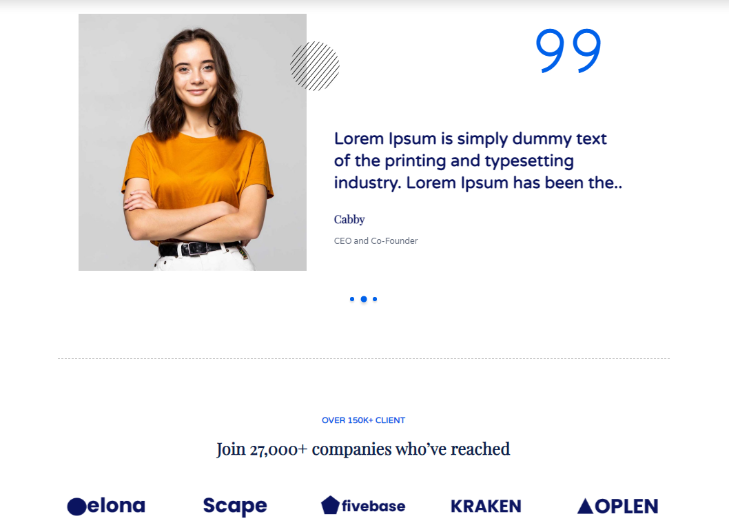
- Here is the Horizontal divider. You can use divider to divide the sections, columns and etc.,
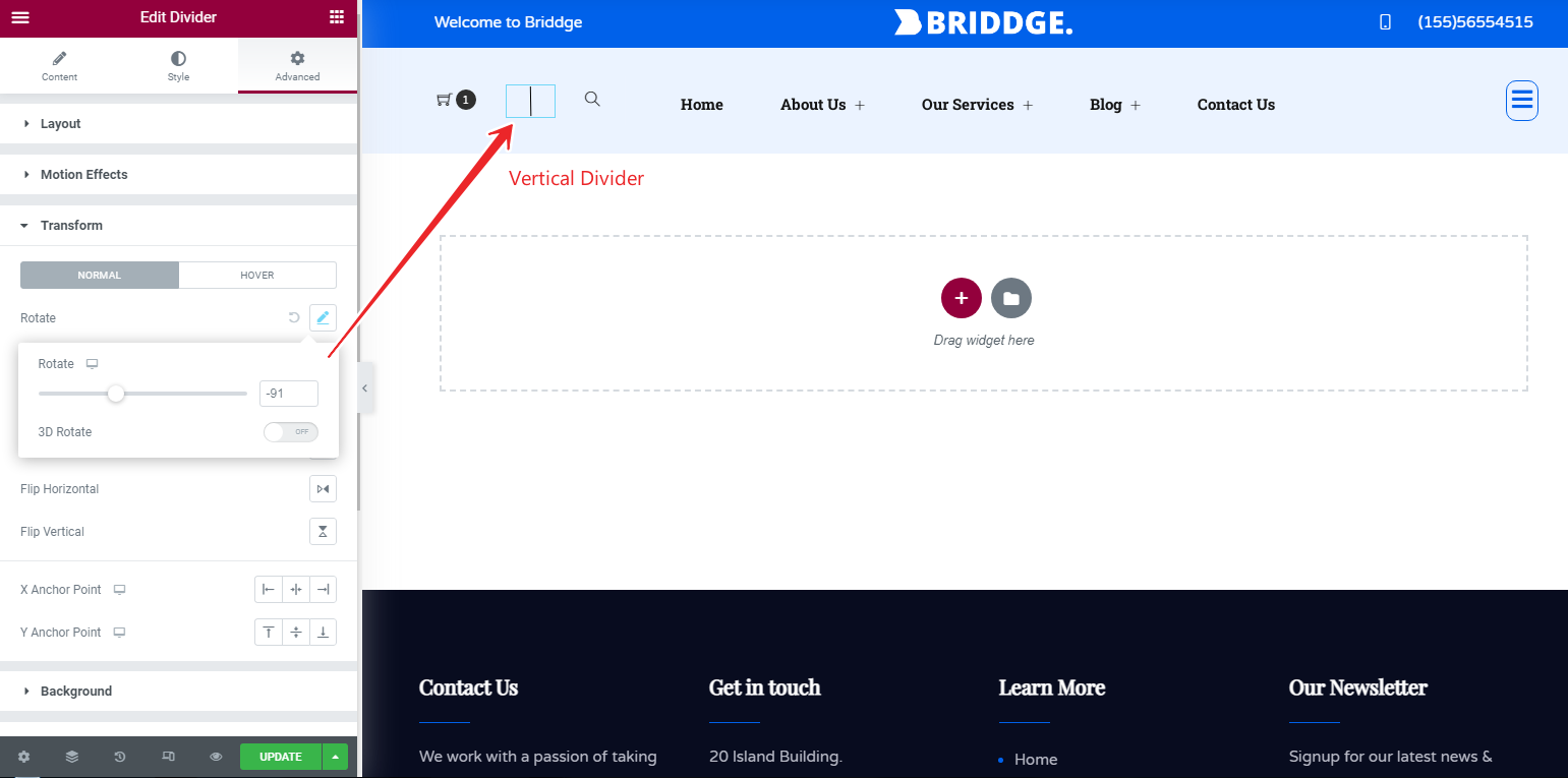
- Edit Divider Shortcode>> Advanced >> Transform >> Rotate >> Here you can rotate your divider vertically or in other directions.
Divider Examples
This section discloses the sources of various files used within the theme and describes their function. Use this section to gain an understanding on how the theme functions behind the scenes, if considering any type of modification.
-
Fonts:
-
Used Google Fonts For Full Theme. You can also change any google font.
-
Images:
- Used Pexels
- Used Pixabay
Thank you for purchasing our Zozo Header Footer Plugin. We hope that you find all your questions regarding this Plugin answered in this Documentation as much in details as possible. However, if you still need support, do not hesitate to contact us at our support forum for this Plugin. If you have any questions that are beyond the scope of this help file, Feel free to post them on our Support Ticket center. Thanks so much!

